


Wedding invitation calligraphy transforms a piece of paper into the first emotional experience your guests have of your celebration. It sets the tone before anyone steps through a venue door, and when done well, it communicates care, elegance, and personal intention in a way no printed font can replicate.
This step-by-step tutorial covers everything you need to approach wedding invitation calligraphy with confidence, from choosing your tools and script to laying out your composition and addressing the outer envelope. Whether you are attempting a DIY project or preparing to hire a professional, understanding the process makes every decision clearer.
What You Need Before You Begin
Attempting wedding invitation calligraphy without the right materials is one of the most common and preventable sources of frustration. Before you commit a single letterform to your final invitation stock, your tools need to be tested, calibrated, and reliable.
Calligraphy Script Choice
Your first decision is script selection, and it should be made before purchasing any tools. Copperplate and modern pointed pen scripts are the most commonly used in wedding stationery because their elegant thick-thin contrast photographs beautifully and reads as formal.
Italic scripts are also used in more contemporary, minimalist wedding aesthetics. Gothic or blackletter scripts appear in dramatic, maximalist invitations but require significantly different tools and technique.
For most DIY beginners, a modern calligraphy style with looser letterforms is the most achievable path to a polished result. Reviewing how to choose the right calligraphy style for your wedding before committing prevents mismatched aesthetic choices.
Tools and Materials
For pointed pen scripts, you will need a flexible nib (Nikko G is recommended for beginners), an oblique or straight pen holder, black or colored ink, and smooth-surfaced invitation paper. Hot-pressed cardstock or coated paper prevents nib catches and produces the cleanest hairline strokes.
For modern calligraphy with brush pens, a Tombow Dual Brush Pen or similar felt-tip brush pen simplifies the setup considerably. While the line quality differs from a traditional dip pen, brush pens are more consistent in ink delivery and significantly more forgiving on paper.
Test your ink and nib combination on a sample piece of your actual invitation paper before touching your final stock. Paper behaves differently from your practice sheets.
Step One: Set Up Your Practice System
Professional calligraphers never pick up a pen and start writing directly on final materials. They practice the exact wording of each invitation element multiple times on scrap paper until their hand knows the composition instinctively.
Tracing and Drafting
Write out the complete text of your invitation in your chosen font on a computer and print it at the correct size. Then, using a light box or bright window, trace the computer-printed text with your calligraphy pen to practice the exact letter sequences and spacing decisions required for each piece.
This tracing step is not about copying fonts. It is about rehearsing your movements for the specific combination of words on your invitation so that your hand enters the final piece already prepared.
Practice on Similar Paper
Source scrap pieces of the same paper stock used for your invitations, or purchase a few extra sheets for practice. Paper texture significantly affects ink behavior. Practicing on the same surface you will use for the final piece is the only way to calibrate your ink dilution and pressure accurately.
Step Two: Plan Your Invitation Layout
Wedding invitation calligraphy is not just beautiful letterforms. It is a composition that guides the eye through information in a logical, elegant sequence.
Standard Invitation Information Hierarchy
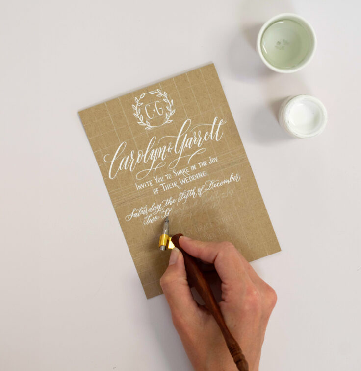
Most formal wedding invitations present information in this order: the hosting line (who is giving the wedding), the request line (“invite you to celebrate”), the couple’s names (typically the largest element), the date and time, the venue name and address, and the reception details.
Each of these elements should occupy its own visual zone on the page. Allow breathing room between lines, particularly around the couple’s names, which should be visually prominent relative to all other text.
Centering and Symmetry
Traditional formal invitations use centered text alignment. Achieving this with calligraphy requires planning your line lengths before committing to final paper.
Write each line on practice paper and measure its physical length. Compare this to the width of your invitation card and calculate where each line should begin to appear centered. Mark your starting points lightly in pencil on the final paper before inking.
Some calligraphers create a full-size paper mock-up of the entire invitation, spacing all elements and checking proportions before touching the final stock. This step adds time but dramatically reduces errors on expensive materials.
Step Three: Write the Couple’s Names
The couple’s names are the focal point of every wedding invitation. They should be written in the largest, most elegant script on the page, with deliberate flourishes or swashes if your chosen style supports them.
Name Sizing and Proportion
A general guideline is that the couple’s names should be written at one-and-a-half to twice the size of the body text elements (date, venue, time). In pointed pen scripts, this allows more dramatic thick-thin variation in the name while keeping supporting text legible and clean.
Flourishing the Names
Decorative flourishes on the first letter of each name or on the connecting “and” between names are one of the defining aesthetic elements of formal wedding calligraphy. These should be practiced extensively before attempting on final paper.
The key principle for flourishing is that every decorative stroke should add elegance without sacrificing legibility. If a flourish makes the letter harder to read, it has crossed the line from decoration into distraction. The handwritten magic of a well-composed wedding element lies precisely in this balance between decoration and clarity.
Step Four: Write the Date, Time, and Venue
Supporting text elements should be written in a clean, smaller version of your chosen script. Consistency is more important than drama here. These lines need to be easy to read at a glance, particularly the venue address which guests may reference multiple times.
Spelling Out Numbers
Formal wedding invitations traditionally spell out all numbers rather than using numerals. “The twenty-first of June” is more formal than “June 21st.” Similarly, times are typically written as “half past six in the evening” rather than “6:30 PM.”
This convention applies specifically to formal invitations. Contemporary or casual wedding aesthetics may use numerals and abbreviated time formats as an intentional stylistic choice.
Ink Consistency
As you write through all the elements of an invitation, your ink may thicken slightly as it dries on the nib. Dip frequently, and if your ink thickens in the bottle, add one or two drops of distilled water and stir gently. Consistent ink flow is essential for uniform stroke quality across the entire composition.
The calligraphy process from ink to envelope covers this technical management in depth and is worth reviewing before your first full invitation session.
Step Five: Dry, Review, and Correct
Once you complete a piece, allow it to dry flat for a minimum of ten minutes before handling it. Smudging wet ink on final stationery is one of the most frustrating possible errors, and it is entirely avoidable with patience.
Erasing Pencil Guidelines
After the ink has fully dried (typically 15 to 20 minutes for standard inks on smooth paper), use a soft artist’s eraser to remove any pencil guidelines or registration marks. Use a light, controlled touch and brush away eraser debris with a soft brush rather than your hand to prevent smearing.
Reviewing Your Work
Hold each completed invitation at arm’s length and review it as a whole composition before filing it as finished. Common issues to look for include uneven line spacing, letters that drift above or below the baseline, ink blobs from over-dipping, and inconsistencies in the slant angle.
Minor imperfections are expected and, in genuine handwork, are a mark of authenticity rather than failure. However, significant errors that affect legibility or visual balance warrant rewriting the piece.
Step Six: Address the Envelopes
Addressed envelopes are the first tactile experience your guests have with your invitation suite. They deserve the same care and attention as the invitation itself.
The outer envelope traditionally includes the full formal name of the recipient, their address with street written in full, city, state, and postal code on separate lines. Abbreviations are avoided in formal settings.
A dedicated guide on addressing envelopes with calligraphy, including etiquette and technique, covers the specific layout and honorific conventions in detail.
When to Hire a Professional Instead
DIY wedding invitation calligraphy is achievable, but it requires significant time investment, practice material costs, and tolerance for imperfection in early attempts. For couples with large guest counts, tight timelines, or high aesthetic standards, hiring a professional calligrapher is the more reliable path to stunning results.
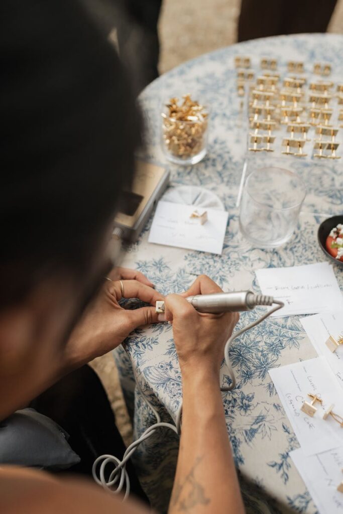
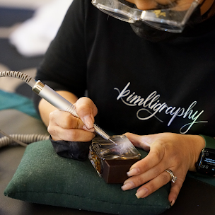
Professional calligraphers like Carla Schall have invested years developing the speed, consistency, and technical range required to execute large volumes of flawless work on schedule. Understanding whether calligraphy is worth it for your wedding involves weighing your time, budget, and quality expectations honestly.
The cost of professional wedding calligraphy relative to the time required to develop proficiency often makes professional services the more economical choice when guest lists exceed 50 envelopes.
How to Do Wedding Invitation Calligraphy Successfully
Successful wedding invitation calligraphy comes down to three things: thorough preparation, quality materials, and extensive practice before touching final stock. Most beginner errors trace back to skipping one of these three stages.
Start your practice six to eight weeks before your invitation deadline. Give yourself permission to write badly in the early sessions. The quality will come, and when it does, the experience of handing someone a piece of stationery that you created entirely by hand is genuinely remarkable.
FAQ
An experienced calligrapher can typically complete 10 to 15 high-quality invitation pieces per hour. For a beginner, the pace is considerably slower, and additional time must be accounted for drying, review, and rewriting any pieces with errors.
Black walnut ink, sumi ink, and high-quality India ink are popular choices for wedding calligraphy. Gouache mixed to a creamy consistency is used for colored inks. Always test your chosen ink on your actual paper stock before beginning final work.
Yes, fountain pens with italic or calligraphy nibs can produce beautiful results on certain paper stocks. They offer more consistent ink delivery than dip pens, which can be beneficial for beginners tackling large quantities.
Formal wedding invitations are typically sent six to eight weeks before the wedding. If you are doing calligraphy yourself, begin your practice and address your envelopes at least ten to twelve weeks before the event to allow adequate preparation time.
Yes, and this hybrid approach is increasingly popular. The couple’s names and key design elements are done in calligraphy while supporting text (RSVP information, dress code details) is printed for legibility and efficiency.
Skip the DIY stress and hire Carla for flawless wedding calligraphy that leaves a lasting impression from the very first envelope. Get started at carlaschall.com