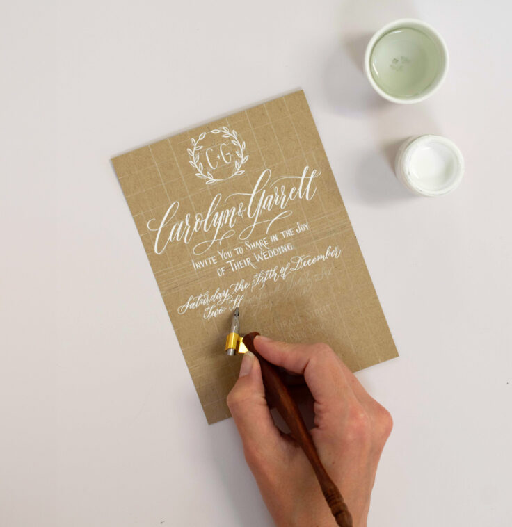


To create wedding invitation calligraphy, first finalize your invitation wording, then choose a script that matches your wedding’s formality (Copperplate for traditional, Modern Calligraphy for contemporary), lay out the text hierarchy on paper or digitally before committing ink, and either hand-letter each piece with a pointed pen or brush pen, or use a digital calligraphy tool or font to design a printable version. Whether you DIY it or hire a professional, the process is the same: wording first, script second, layout third, production last.
This guide is specifically about creating the invitation piece itself — the wording, the lettering, the layout — rather than addressing envelopes, which we cover in full in our separate wedding envelope calligraphy addressing guide. If you’re looking for etiquette on how to write a guest’s name and address, that guide is the one you want; if you’re figuring out how to actually design and letter the invitation card that goes inside the envelope, you’re in the right place.
Step 1: Finalize Your Wedding Invitation Wording
Before any calligraphy happens, you need locked-in text. Calligraphy layout depends entirely on knowing exactly how much text needs to fit, so wording changes after lettering begins are costly to fix.
A traditional wedding invitation wording structure includes:
- Host line (whoever is hosting/inviting — traditionally the couple’s parents, though modern invitations often list the couple themselves)
- Request line (“request the pleasure of your company” or “invite you to celebrate their marriage”)
- Couple’s names
- Date and time
- Venue name and address
- Reception details (if on the same card)
- Dress code or additional notes (if applicable)
A simple modern wording example: Together with their families, [Couple’s Names] invite you to celebrate their marriage. Saturday, the twelfth of September, two thousand twenty-six, at four o’clock in the afternoon. [Venue Name], [City, State].
A more traditional wording example: Mr. and Mrs. [Parent Names] request the honor of your presence at the marriage of their daughter [Bride’s Name] to [Groom’s Name]. Saturday, the twelfth of September, two thousand twenty-six…
What to write on the invitation card front, specifically: If your invitation uses a decorative front panel (common with pocket-fold or layered invitation styles), it typically carries just the couple’s names or a monogram in the most decorative calligraphy of the whole suite, with the full wording and details inside or on a following card.
How to write names on an invitation card: Full first and last names are standard for the couple’s own names on a formal invitation, written in your largest, most decorative lettering, since this is the visual focal point of the entire piece.
Step 2: Choose Your Script and Tools
Your script choice should match your wedding’s overall formality and aesthetic, not just personal preference in isolation.
- Copperplate — Traditional, elegant, and the most requested style for formal invitation suites. Requires a pointed, flexible dip nib (Nikko G or Hunt 101), an oblique or straight holder, and smooth, high-quality paper.
- Modern Calligraphy — Relaxed, expressive, and considerably faster to learn, suited to contemporary or casual weddings. Requires only a brush pen, such as a Tombow Fudenosuke or Tombow Dual Brush.
- Italic — A structured, classic middle ground between Copperplate’s formality and Modern Calligraphy’s ease, written with a broad-edge nib or fountain pen.
- Flourished or Gothic accents — Used selectively for dramatic couple’s names or monograms on more maximalist, black-tie invitation suites.

For the full breakdown of every major style with tools and difficulty compared side by side, see our complete guide to types of calligraphy styles.
A Beginner’s Guide to Pointed Pen Calligraphy Technique
If you’re planning to hand-letter your own invitations in Copperplate or another pointed-pen script, here’s the core technique to build before touching your real cardstock.
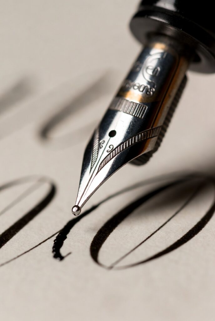
- Load your nib correctly. Dip just past the vent hole (the small hole near the base of the nib), and tap off excess ink so it doesn’t blot on your first stroke.
- Hold the pen at a consistent, relaxed angle — roughly 55 degrees for Copperplate — resting the holder against the web of your hand rather than gripping tightly, since tension is the most common cause of shaky lines.
- Practice the two pressure states separately before combining them. Thin hairline upstrokes use minimal pressure; thick downstrokes use firm, confident pressure that spreads the nib’s tines apart.
- Drill ovals and compound curves — the foundational shapes nearly every Copperplate letter is built from — until they’re smooth and consistent before attempting full letters.
- Practice on guide sheets with printed slant lines rather than freehand, since consistent slant is the hardest thing to self-correct without a visual reference.
- Write real words on scrap paper before your final cardstock. Spacing and rhythm only become intuitive through connected writing, not isolated letter drills.
- Test your ink and nib on your actual invitation paper stock before starting your real batch — different papers absorb ink differently, and what works on practice paper may bleed or feather on your final cardstock.
Step 3: Plan Your Layout Before You Letter
Layout is where most beginner invitation calligraphy goes wrong — not the handwriting itself, but the planning that happens before it.
- Sketch your full layout in pencil first, including every line of text, so you can see exactly how much space each element needs before committing in ink.
- Establish a size hierarchy. The couple’s names are typically the largest and most decorative; the date, venue, and details use a smaller, more restrained companion script for legibility.
- Center your layout visually, not just mathematically — the optical center of a card (accounting for how longer lines “read” heavier) often sits slightly above true mathematical center.
- Leave generous margins. Text that runs too close to the card’s edge looks cramped and unfinished, even if every individual letter is beautifully formed.
- Do a full test piece on scrap cardstock cut to your invitation’s exact size before starting your real batch, checking that your complete wording actually fits with room to breathe.
Digital and Online Calligraphy: Fonts, Free Tools, and When to Use Them
Not every couple wants to (or has time to) hand-letter their entire invitation suite, and that’s a completely valid choice — digital calligraphy is a real, popular category, not a lesser substitute.
Calligraphy fonts vs. hand lettering: A calligraphy font is a digital typeface designed to imitate the look of hand-lettered script when typed and printed. It’s the fastest, most affordable way to get a calligraphy look across an entire invitation suite, especially for a larger guest list where full hand-lettering on every piece would be costly and time-consuming.
What to look for in a calligraphy font for wedding invitations:
- Good legibility at your printed size, not just as a large display sample
- A complete, matching character set (many free fonts only include capital letters or lack proper connecting swashes for lowercase script)
- A license that covers commercial or personal print use — many free fonts restrict commercial reproduction, which technically applies to printed invitations
Free and online tools: Free calligraphy fonts and generators are widely available and can be a reasonable starting point for practice pieces, save-the-dates, or budget-conscious DIY projects. For the piece that represents your entire wedding’s first impression, though, most couples find that a genuinely well-executed hand-lettered or professionally designed digital piece looks noticeably more polished than a free generic font — it’s often worth budgeting for at least the primary invitation card even if you handle other suite pieces yourself.
Digital calligraphy done for you: If you’d rather skip the DIY font hunt entirely, custom digital calligraphy designed specifically for your invitation gives you a hand-lettered look without the time investment of learning the craft yourself — see our custom calligraphy services for options.
DIY vs. Hiring a Professional for Invitation Calligraphy
DIY makes sense if: You enjoy the process, have time well ahead of your printing deadline, and are comfortable with your invitations having some natural handmade variation rather than perfect, gallery-level uniformity.
Hiring a professional makes sense if: You want a flawless, consistent final product; you’re working with a tight timeline; your wording is complex or lengthy; or you simply want your invitation — the very first impression your guests get of your wedding — handled by someone with years of dedicated technique behind it.
Who offers custom calligraphy and proofing services for wedding invitation wording? At Carla Schall Designs, invitation suite design (including wording review and proofing) is one of our core wedding services, alongside envelope addressing, place cards, and signage. Proofing matters more than most couples expect — a professional set of eyes catches inconsistent titles, missing details, and formatting issues before they’re lettered onto expensive cardstock, not after. Get in touch for a custom quote, or see our wedding calligraphy pricing guide for typical costs.
Wedding Invitation Wording Examples for Different Scenarios
Beyond the traditional and modern examples above, here’s how wording shifts for a few common situations couples ask about.
Adults-only wedding: Together with their families, [Couple’s Names] invite you to celebrate their marriage… We respectfully request an adults-only celebration. Placing this note clearly, but not as the most decorative line on the page, keeps the invitation elegant while still communicating clearly.
Destination wedding: Destination invitations typically include more logistical detail up front — travel information, accommodation suggestions, or a wedding website — often on a supplementary card rather than crowding the main invitation itself, so the primary piece can stay focused on the couple’s names, date, and location.
Religious ceremony wording: Formal religious wording traditionally includes a specific phrase referencing the ceremony type — for example, “request the honor of your presence at the marriage of” for a religious ceremony, versus “request the pleasure of your company at the marriage of” for a non-religious one — a small wording distinction with real etiquette weight worth getting right.
Reception-only or second card wording: When reception details differ from the ceremony (different venue, later start time), a separate reception card is traditional: Reception to follow at [Venue Name], [Time]. This keeps the primary invitation card focused and legible rather than overloaded with every logistical detail.
Couple hosting themselves (no parent host line): [Couple’s Names] request the pleasure of your company as they celebrate their marriage… — increasingly common for couples paying for their own wedding or blending non-traditional family structures.
Whichever wording style you choose, consistency in tone matters more than strict adherence to tradition — a formal script paired with very casual wording (or the reverse) tends to feel visually mismatched, even when both elements are individually well-executed. If you’re unsure which register fits your wedding, it’s worth reading your finalized wording out loud; if it sounds like how you and your partner would actually describe your day to a close friend, it will almost certainly read well on the page too.
Choosing Paper, Ink, and Color for Invitation Calligraphy
The material choices behind your invitation calligraphy affect both how the lettering looks and how forgiving the writing process is.
- Paper weight and texture: Smooth, heavier cardstock (100lb+) holds ink cleanly and resists bleeding far better than lightweight or heavily textured paper, particularly for pointed-pen scripts like Copperplate.
- Ink type: Standard calligraphy ink works well for most invitation projects; metallic inks (gold, silver, copper) add a formal, luxurious feel but require more careful nib maintenance since metallic particles can clog a pointed nib faster than standard ink.
- Color and legibility: Dark ink on light paper remains the most legible combination and photographs best; light or metallic ink on dark paper looks striking but can be genuinely harder to read at a glance, so it’s worth testing readability at arm’s length, not just up close.
- Envelope liners and accent pieces: If you’re investing in calligraphy for the invitation itself, coordinating accent pieces — a monogram on the envelope liner, a wax seal, a ribbon-tied belly band — extend the same hand-crafted feel through the whole unboxing experience without requiring additional full calligraphy pieces.
Troubleshooting Common Invitation Calligraphy Problems
- Ink bleeds or feathers on the cardstock: This is almost always a paper problem, not a technique problem. Switch to a smoother, less absorbent cardstock, or test a bleed-proofing spray on your specific paper stock before your final run.
- Lettering looks inconsistent across a large batch: Fatigue is the most common cause once you’re past the first 20–30 pieces. Work in shorter sessions with breaks rather than one long marathon session, since hand fatigue shows up in your letterforms before you consciously notice it.
- Text doesn’t fit the way it did in your practice sketch: This usually means your actual cardstock has slightly different dimensions or margins than your sketch paper. Always do your final layout test on cardstock cut to the exact real dimensions, not a generic practice sheet.
- Colored or metallic ink looks patchy or uneven: These inks often need more thorough mixing and more frequent stirring during use than standard black ink, since pigment settles faster, especially with hand-mixed gouache-based inks.
A Realistic Production Timeline
- 8+ weeks before mailing: Finalize wording, choose paper and script, and complete a full test piece.
- 6–8 weeks before mailing: Begin lettering or send your order to a professional calligrapher; confirm final guest count and any late wording changes now, not later.
- 3–4 weeks before mailing: Complete lettering and assembly (inserts, liners, seals); do a final proofread of every piece against your guest list.
- 2 weeks before mailing: Weigh a fully assembled sample invitation to confirm correct postage, then mail.
A Note for International Searchers
This guide covers Western, English-language wedding invitation wording and Latin-script calligraphy (searched in other languages as einladung kalligraphie in German or calligraphie d’invitation in French, among others). The underlying scripts — Copperplate, Modern Calligraphy, Italic — are the same regardless of the language your final wording is written in, so the technique and layout guidance above applies whether your invitation text ends up in English or another language.
Invite Format: Standard Card Sizes and Layout Conventions
If you’re designing from scratch rather than working from a template, these are the format conventions worth knowing before you finalize your layout.
- Standard invitation card sizes typically range from 5×7 inches for a single-panel card to A7 (5.25×7.25 inches) for invitations that need to fit a standard A7 envelope — check your envelope size before finalizing your card dimensions, not after.
- Portrait vs. landscape orientation is purely aesthetic, though portrait remains the more traditional and common choice for formal wedding suites.
- Single card vs. multi-piece suite: A single card works well for simpler weddings with fewer logistical details; a multi-piece suite (main invitation, reception card, RSVP card, details card) suits more complex weddings with separate ceremony and reception venues, dress codes, or travel information.
- Margins: Keep at least a half-inch margin on every edge as a baseline, increasing it further for more minimalist or luxury-feeling designs, since generous white space reads as intentional rather than as unused space.
Keeping Your Invitation Calligraphy Cohesive With the Rest of Your Suite
Your invitation is rarely the only calligraphed piece in your wedding stationery, and matching it to the rest of your suite (save-the-dates, envelope addressing, reception details) makes the whole experience feel considered rather than assembled from mismatched parts.
- Use one primary script across every piece, from save-the-dates through envelope addressing through place cards, even if size and ink color vary by piece.
- Save-the-dates typically use a slightly simpler version of your invitation’s script and layout, since they’re an earlier, less formal touchpoint — see our note on save-the-date envelopes in the envelope addressing guide for more detail.
- Reception-day pieces (place cards, menus, signage) can use the same script at a smaller, more functional scale, keeping your invitation’s formal opening statement consistent all the way through to the reception itself.
Common Mistakes When Creating Wedding Invitation Calligraphy
- Starting lettering before wording is finalized. Any late wording change means redoing a hand-lettered piece from scratch — always lock your text first.
- Ignoring layout planning. Jumping straight to ink without sketching the full text hierarchy is the single biggest cause of cramped, unbalanced-looking invitations.
- Mixing too many scripts on one piece. One primary script, with at most one simpler companion script for supporting details, reads as intentional; three or more competing styles reads as disorganized.
- Choosing a free font without checking the full character set. Many free calligraphy fonts look beautiful in a large display sample but fall apart at smaller printed sizes or are missing key connecting characters.
- Skipping a proof print before the full run. Always print or letter a single test piece at final size and paper stock before committing to your entire guest count.
Frequently Asked Questions
Finalize your wording first, choose a script that matches your wedding’s formality, sketch your full layout in pencil before inking, and either hand-letter with a pointed pen or brush pen, or use a calligraphy font to design a printable version.
Free online calligraphy fonts and generators are a reasonable option for practice pieces or budget DIY projects, but check the license terms for commercial/print use and verify the font includes a complete, legible character set before committing to your full invitation run.
The best font depends on your wedding’s formality: a Copperplate-style script font suits traditional and formal weddings, while a looser, brush-style script font suits contemporary or casual celebrations. Prioritize legibility at your actual printed size over how a font looks in a large display sample.
A traditional structure includes a host line, a request line, the couple’s names, the date and time, the venue, and any reception or dress code details. Modern invitations often simplify this to just the couple’s names, date, and venue.
The couple’s full first and last names are standard, written in the largest, most decorative lettering on the piece, since it’s typically the visual focal point of the entire invitation.
Hand-lettering your own invitations works well if you enjoy the process and have time before your deadline. Hiring a professional makes more sense for tight timelines, complex wording, or when you want guaranteed, gallery-level consistency across your entire guest list.
A pointed, flexible dip nib such as a Nikko G, a straight or oblique pen holder, non-waterproof calligraphy ink, and smooth, bleed-resistant cardstock that’s been tested with your specific ink beforehand.
Yes. Digital calligraphy fonts or custom digital designs offer a consistent, calligraphy-inspired look at a lower cost and faster turnaround than full hand-lettering, and are especially practical for larger guest lists.
This guide covers creating the invitation card itself — wording, script, layout, and lettering technique. Our envelope addressing guide covers the separate process of addressing the outer and inner envelopes, including etiquette for titles, married couples, and families.
Most wedding calligraphy projects, including invitation design and lettering, take four to eight weeks depending on complexity and guest count, so it’s worth starting the process well ahead of your mailing date regardless of whether you DIY or hire a professional.
Standard sizes typically range from 5×7 inches for a single-panel card to A7 (5.25×7.25 inches) to fit a standard A7 envelope. Confirm your envelope size before finalizing your card dimensions, since the two need to match.
Whether you’re hand-lettering your own invitations or want a fully custom suite designed for you, getting the wording and layout right is just as important as the penmanship. Get in touch about custom wedding invitation calligraphy for a personalized quote, or book a beginner calligraphy workshop if you’d like hands-on guidance before lettering your own invitations.