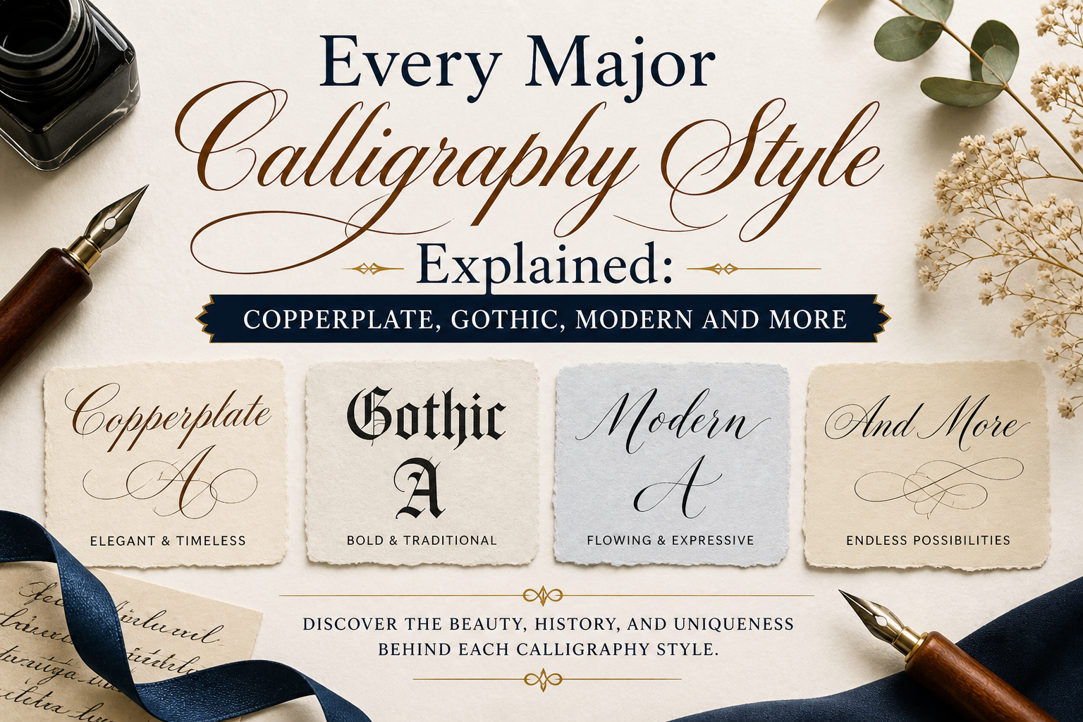


Calligraphy is not one style it’s a family of distinct scripts, each with its own tools, rules, and history. The major types practiced today fall into four broad families: pointed-pen scripts (Copperplate, Spencerian), broad-edge scripts (Italic, Gothic/Blackletter, Uncial), brush scripts (Modern Calligraphy, Brush Lettering), and drawn/monoline styles (Faux Calligraphy). Within those families, the most commonly referenced individual styles are Copperplate, Spencerian, Italic, Gothic, Modern Calligraphy, Brush Lettering, and Faux Calligraphy each suited to different tools, skill levels, and projects.
Whether you’re drawn to the dramatic blackletter of medieval manuscripts or the flowing loops of a modern wedding invitation, every major calligraphy style has a story worth knowing. Picking up a pen without knowing which style you’re actually attempting is one of the most common beginner mistakes this guide walks through the most significant styles practiced today, covering their origins, defining characteristics, required tools, and what kind of learner and project each one suits best. Consider it your definitive reference map before you commit to a style or sign up for a class.
What Is Calligraphy? (Meaning and Definition)
Calligraphy comes from the Greek words kallos (beauty) and graphein (to write) — literally, “beautiful writing.” It refers to the art of forming letters with intentional, controlled strokes using tools that create deliberate variation between thick and thin lines, distinguishing it from ordinary handwriting. Every calligraphic tradition, regardless of style or culture, shares this same foundation: rhythm, structure, and controlled variation in stroke weight.
How Many Types of Calligraphy Are There?
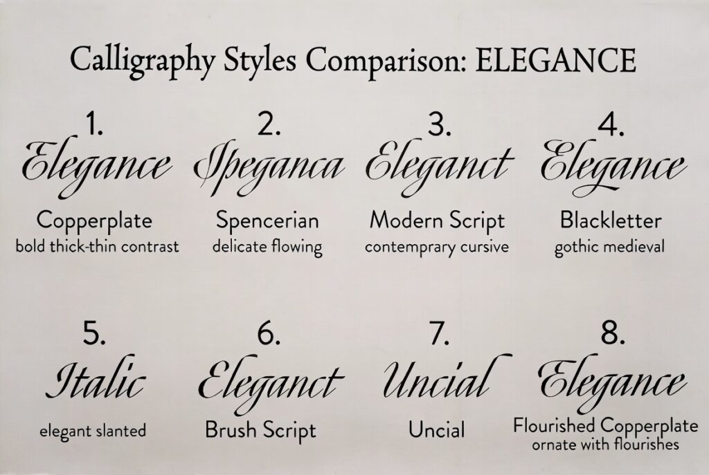
There’s no single official count — calligraphy has been practiced across nearly every writing culture in the world for centuries, and new hybrid styles continue to emerge. For Western, Latin-alphabet calligraphy specifically (the focus of this guide), practitioners generally group scripts into four practical families:
- Pointed-pen scripts — Copperplate, Spencerian, Engrosser’s Script. Built on a flexible, pointed nib and pressure-controlled thick-thin contrast.
- Broad-edge scripts — Italic, Gothic/Blackletter, Uncial, Foundational Hand. Built on a flat-edged nib held at a consistent angle.
- Brush scripts — Modern Calligraphy, Brush Lettering. Built on a flexible brush tip, with contrast created through pressure, similar in principle to pointed-pen scripts but far more forgiving.
- Drawn/monoline styles — Faux Calligraphy, hand lettering. Created with any standard pen or pencil by drawing (not writing) the thick-thin effect after the fact.
Within those four families, you’ll typically encounter six to eight named styles in everyday use — which is where the popular “four types” and “seven styles” framings both come from, depending on whether a source is counting families or individual named scripts.
Major Calligraphy Styles: Overview Table
| Style | Family | Era / Origin | Tool | Difficulty | Best Use |
| Copperplate | Pointed pen | 18th-century England | Flexible pointed nib | Advanced | Wedding stationery, formal correspondence |
| Spencerian | Pointed pen | Mid-19th-century USA | Flexible pointed nib | Advanced | Vintage/ornamental pieces, business-script heritage work |
| Italic | Broad edge | 15th-century Italy | Flat/chisel nib | Easy–Moderate | Envelope addressing, formal invitations, foundational training |
| Gothic (Blackletter) | Broad edge | 12th–15th-century Europe | Flat/chisel nib | Moderate–Advanced | Dramatic, formal, or vintage-themed pieces; logos; tattoos |
| Uncial / Foundational | Broad edge | Early medieval Europe | Flat/chisel nib | Moderate | Building disciplined fundamentals |
| Modern Calligraphy | Brush | 20th–21st century | Brush pen | Easiest | Event signage, journaling, gifts, social content |
| Brush Lettering | Brush | 20th–21st century | Brush pen | Easy | Bold signage, florals, social captions |
| Faux Calligraphy | Drawn/monoline | Any era (technique, not historical script) | Any pen or pencil | Easiest | Practicing letterforms, kids’ projects |
Copperplate: Origins, Characteristics, and Best Uses
Origins: Copperplate developed in 18th-century England, named after the copper printing plates used to reproduce elegant handwriting samples for instructional copybooks. It’s also known as English Roundhand, and the closely related American variant used for formal documents is called Engrosser’s Script.
Characteristics: A consistent 55-degree slant, dramatic pressure-based thick-thin contrast, and rounded, curvilinear letterforms. It is the dominant style in formal wedding stationery, envelope addressing, and luxury event signage, and many professional calligraphers, including those who go on to develop their own signature hands, trace their primary training back to Copperplate foundations.
Tools: A pointed, flexible nib such as a Nikko G or Hunt 101, an oblique or straight pen holder, and smooth, high-quality paper. Ink viscosity matters significantly here — walnut ink, sumi ink, and properly diluted gouache are popular choices among working artists for the specific line quality they produce.
Best for: Formal wedding stationery, envelope addressing, business branding with a classic aesthetic, and calligraphers willing to commit to a multi-month learning curve. For the complete head-to-head against Italic, including which to learn first, see our Copperplate vs Italic comparison.
Spencerian: History, Characteristics, and Comparison to Copperplate
History: Spencerian penmanship was developed in the United States in the mid-1800s by Platt Rogers Spencer and became the standard business script taught in American schools for decades. Before typewriters existed, Spencerian was the handwriting system used across the country for business correspondence, ledgers, and personal letters — a genuinely practical, everyday script rather than a purely decorative one.
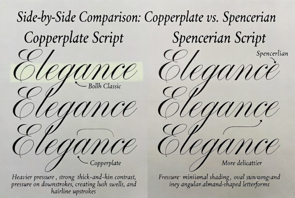
Characteristics: Lighter overall pressure than Copperplate, more delicate shading, and graceful, elongated curves and loops rather than dramatic thick-thin swells. It reads as softer and more fluid than Copperplate’s precise, engraved-looking uniformity.
Copperplate vs. Spencerian — key differences:
- Pressure: Copperplate uses heavier, more dramatic pressure contrast; Spencerian is lighter and more delicate throughout.
- Letterforms: Copperplate letters are more compact and uniform; Spencerian letters are more elongated, with sweeping ovals and looping ascenders/descenders.
- Historical use: Copperplate was developed for formal, engraved reproduction; Spencerian was developed as genuine everyday American penmanship.
- Learning difficulty: Both require developed pressure control and take months to master, though many calligraphers find Spencerian’s lighter touch slightly less physically demanding once the fundamentals click.
For the complete breakdown of tools, timelines, and which script suits which goal, see our dedicated Spencerian vs Copperplate guide.
Italic: Origins, Characteristics, and Best Uses
Origins: Italic developed in Renaissance Italy in the 15th century as a faster, more compact alternative to the heavier Gothic hands used in formal manuscripts at the time, and became the preferred hand of humanist scholars and scribes.
Characteristics: A fixed nib angle (typically 45 degrees) rather than pressure creates the thick-thin contrast, built on a compressed oval letterform with a slight forward lean. Because the contrast comes from geometry rather than touch, Italic is mechanically more repeatable and forgiving than pointed-pen scripts.
Tools: A broad-edge nib, available as a fountain pen (Pilot Parallel and Manuscript are popular beginner choices) or a dip pen. Paper requirements are far less demanding than pointed-pen scripts — layout, cartridge, or good printer paper all work well.
Best for: Complete beginners, envelope addressing, and as foundational training before attempting Gothic or other broad-edge historical hands. Full comparison and step-by-step practice guidance is in our Copperplate vs Italic guide.
Gothic (Blackletter): History, Substyles, and Applications
History: Gothic calligraphy, also called blackletter or textura, is one of the oldest surviving Western calligraphy styles, dominating European manuscript culture from roughly the 12th century through the invention of the printing press in the 15th century.
The Gothic architecture connection: The name isn’t a coincidence. Both Gothic architecture and Gothic script emerged from the same medieval European period and share a defining visual language — dense, vertical, angular forms with minimal curved space, whether carved in stone or drawn in ink. Art historians later applied the term “Gothic” retroactively to both the architectural style and the lettering style because of that shared angularity and period, not because either literally influenced the other’s construction.
Common Gothic substyles and their applications:
- Textura — The most rigid, densely packed substyle, historically used for the most formal illuminated manuscripts and Bibles; today used for dramatic invitations and formal branding.
- Fraktur — A slightly more rounded German variant with distinctive fractured, broken curves; still used in German heritage branding, beer labels, and vintage-themed design.
- Rotunda — A rounder, more legible southern-European variant, popular for readability-focused Gothic applications like book design and logos that need to stay legible at smaller sizes.
Characteristics: Dense, angular letterforms with minimal counter space (the enclosed white space inside letters), written with a broad-edge pen.
Best for: Dark, dramatic, or maximalist aesthetics — black-envelope wedding suites, letterpress invitations, tattoo lettering, band and album branding, and heritage-themed logos. For the full history and step-by-step breakdown of every substyle, see our complete Gothic calligraphy guide.
Uncial and Foundational Hand
Foundational hand is what most calligraphy schools teach first, even before Italic, because it builds controlled, intentional mark-making with a broad-edge pen that transfers directly to every other script in that family. Uncial, its related historical ancestor, was used in early medieval European manuscripts and is defined by rounded, majuscule (capital-style) letterforms with minimal slant. Calligraphers who skip foundational training often develop inconsistent habits in Italic and Gothic that limit their range later on.
Modern Calligraphy: Defining Characteristics
Modern calligraphy is the newest major style on this list — a 20th- and 21st-century departure that deliberately treats historical rules as optional rather than binding.
Defining characteristics:
- Letters can bounce off the baseline rather than sitting on a fixed line
- Height and slant can vary intentionally within a single word for expressive effect
- Upright and slanted letterforms can mix freely in the same piece
- Written almost exclusively with a brush pen rather than a dip nib
- Rewards experimentation and personal style rather than punishing small inconsistencies
Tools: Brush pens such as the Tombow Fudenosuke (firmer tip, more control) or Tombow Dual Brush (softer tip, more expressive range) dominate this category, since they require no ink-loading and produce reliable results almost immediately.
Best for: Beginners who want fast, polished-looking results, event signage, journaling, gift tags, and social media content. It’s the most commonly recommended entry point into calligraphy as a whole — see our full beginner style guide for a complete decision framework.
Brush Lettering
Closely related to modern calligraphy and using the same brush pens, brush lettering leans more bold and illustrative, often used for signage, florals, and social captions rather than formal stationery. Many beginners end up practicing brush lettering and modern calligraphy simultaneously without realizing they’re technically two related-but-distinct categories.
Faux Calligraphy
Faux calligraphy uses an ordinary pencil, gel pen, or marker to simulate the look of calligraphy — you write the word normally, then go back and manually thicken the downstrokes. It requires zero special tools, making it the fastest way to understand letterform structure before investing in nibs or brush pens, and it’s especially well suited to teaching kids the visual logic of calligraphy before introducing real tools.
Traditional vs. Modern Calligraphy: Tools and Uses Compared
| Traditional (Copperplate, Spencerian, Gothic, Italic) | Modern (Brush, Faux) | |
| Rule structure | Strict historical rules for letterforms, slant, spacing | Rules are optional guidelines |
| Primary tool | Pointed or broad-edge nib | Brush pen or any standard pen |
| Learning curve | Weeks (Italic) to months (Copperplate, Spencerian) | Days to a few weeks |
| Typical use | Formal stationery, heritage branding, fine art | Journaling, social content, event signage, gifts |
| Consistency requirement | High — mistakes are highly visible | Lower — inconsistency is part of the aesthetic |
For a deeper dive specifically framed around choosing a course or learning path, see our Modern vs Traditional Calligraphy: Key Differences guide and our Modern vs Traditional Calligraphy Courses comparison.
Beyond Western Calligraphy: A Brief Global Note
Calligraphy is a genuinely global art form, and the styles covered above represent the Western, Latin-alphabet tradition this guide focuses on. Two other major world traditions are worth knowing about for context:
- East Asian calligraphy (Chinese calligraphy and Japanese Shodo) uses brush and ink on a completely different structural system, built around character stroke order rather than an alphabet, with deep philosophical and meditative traditions attached to the practice.
- Arabic (Islamic) calligraphy is built around the Arabic script’s inherent flow and connectivity, with major historical styles including Kufic, Naskh, and Thuluth, and has historically served as a central form of religious and artistic expression given restrictions on figurative art in many contexts.
Both traditions are rich enough to deserve their own dedicated study, and while they fall outside the Western scripts taught in our workshops, understanding they exist helps frame calligraphy as a truly global art form rather than a purely European or American one.
Levels of Calligraphers: From Beginner to Master
Calligraphy skill tends to progress through recognizable stages, regardless of which style you’re pursuing:
- Beginner — Focused on isolated stroke drills and basic letterforms; results are legible but inconsistent in weight and spacing.
- Developing — Full alphabets are consistent and legible; beginning to write connected words and short phrases with reasonable rhythm.
- Intermediate — Confident, consistent letterforms at speed; beginning to develop personal flourishes and take on small real projects.
- Advanced — Reliable, polished work suitable for client or commission-level output; often branching into a second style.
- Master — Developed a recognizable personal hand, often teaches others, and may contribute new interpretations or hybrid styles to the field.
Most hobbyist calligraphers spend months at the beginner and developing stages and years reaching advanced work — there’s no shortcut around consistent practice, regardless of natural aptitude.
How to Choose Your First Calligraphy Style
With eight or more named styles in circulation, the decision gets much simpler once you filter by three questions: What do you actually want to make (formal stationery favors Copperplate; everyday projects favor Modern)? How much time can you commit weekly (shorter learning curves favor Modern or Italic)? And do you prefer strict historical rules or creative freedom? Our complete beginner decision guide walks through this framework in full detail, including a head-to-head comparison and a step-by-step learning path.
Visual Characteristics at a Glance: How to Identify Each Style by Eye
If you’re trying to identify a calligraphy style from a photo, invitation, or sign rather than starting from scratch, these are the fastest visual tells for each one.
- Copperplate — Look for dramatically thick downstrokes next to hairline-thin upstrokes within the same letter, a consistent forward slant, and rounded, compact letterforms that look almost engraved.
- Spencerian — Similar pressure-based contrast to Copperplate, but lighter and softer overall, with more elongated ovals and looping ascenders/descenders that feel airier rather than dense.
- Italic — Uniform stroke weight created by nib angle rather than pressure, a compressed oval letter structure, and a slight, consistent forward lean without the dramatic swelling of pointed-pen scripts.
- Gothic/Blackletter — Dense, angular, vertical letterforms with minimal white space inside each letter, giving the script a heavy, almost architectural weight on the page.
- Uncial/Foundational — Rounded, upright letterforms with minimal slant, often written larger and more deliberately than other scripts, giving it a calm, structured appearance.
- Modern Calligraphy — Inconsistent baseline (letters “bounce”), mixed upright and slanted forms within the same word, and a loose, expressive energy that clearly breaks from strict rules.
- Brush Lettering — Bolder, thicker overall stroke weight than modern calligraphy, often more illustrative, and frequently combined with hand-drawn flourishes or florals.
- Faux Calligraphy — Visible “double-lined” downstrokes where the thick effect was drawn in after the word was written, rather than created by a single fluid stroke.
A Quick Timeline: How These Styles Evolved
Seeing the styles in chronological order makes the family relationships between them much clearer.
- Early medieval period — Uncial and Foundational hand establish the rounded, disciplined broad-edge letterforms that later scripts build on.
- 12th–15th century — Gothic (Blackletter) dominates European manuscript culture, developing alongside Gothic architecture during the same period.
- 15th century — Italic emerges in Renaissance Italy as a faster, more compact broad-edge alternative to the heavy Gothic hands of the era.
- 18th century — Copperplate (English Roundhand) develops in England, driven by the copper engraving process used to mass-produce instructional copybooks.
- Mid-19th century — Spencerian is developed in the United States and becomes the standard business penmanship taught in American schools before typewriters existed.
- 20th–21st century — Modern Calligraphy, Brush Lettering, and Faux Calligraphy emerge, deliberately loosening or discarding the historical rule systems that defined every style before them.
Understanding this progression explains a pattern beginners often notice but can’t quite name: styles get more forgiving and less rule-bound the closer they are to the present day, which is exactly why Modern Calligraphy — the newest style on this list — is also consistently ranked the easiest to learn.
Choosing a Style by Project Type
Beyond the general beginner recommendation, here’s how style choice shifts based on what you’re actually creating.
Wedding and event stationery: Copperplate remains the most-requested style by brides and event planners, with Spencerian as a popular alternative for a softer, more vintage-inspired look.
Logos, branding, and letter design ideas: Gothic substyles (particularly Fraktur and Textura) suit heritage or maximalist brands, while Italic and Modern Calligraphy suit brands wanting an approachable, contemporary feel. For letterform inspiration beyond full words, our calligraphy alphabet guide breaks down individual letter construction across styles.
Journaling, gifts, and social content: Modern Calligraphy and Brush Lettering dominate this category, thanks to their low tool cost and fast learning curve.
Teaching kids or complete beginners: Faux Calligraphy is the most forgiving entry point, since it requires no special tools and removes pressure or angle control from the equation entirely.
Common Mistakes When Exploring Calligraphy Styles
- Trying to learn multiple styles at once — different families rely on genuinely conflicting mechanical skills (pressure control vs. angle control), and splitting practice time between them slows progress in both.
- Choosing a style based on how it looks finished, not how it feels to learn — a stunning Copperplate wedding suite represents months of practice, not a realistic first-week expectation.
- Assuming all “calligraphy” uses the same tool — pointed pens, broad-edge nibs, and brush pens are mechanically different tools that don’t transfer directly between styles.
- Skipping historical context — understanding where a script came from (a printing method, a school penmanship standard, a medieval manuscript tradition) makes its rules and letterforms far easier to remember and internalize.
Frequently Asked Questions
The four broad families of Western calligraphy are pointed-pen scripts (Copperplate, Spencerian), broad-edge scripts (Italic, Gothic, Uncial), brush scripts (Modern Calligraphy, Brush Lettering), and drawn/monoline styles (Faux Calligraphy). Within these families, six to eight individually named styles are in common everyday use.
There’s no single official count, since calligraphy has been practiced across many writing cultures for centuries and continues to evolve. For Western, Latin-alphabet calligraphy specifically, most practitioners reference around six to eight major named styles grouped into four practical tool-based families.
Calligraphy, from the Greek for “beautiful writing,” is the art of forming letters with intentional, controlled strokes using tools that create deliberate variation between thick and thin lines, distinguishing it from ordinary handwriting.
Copperplate uses heavier, more dramatic pressure contrast and compact, uniform letterforms, developed for formal engraved reproduction. Spencerian uses lighter pressure with more elongated, sweeping letterforms, developed as genuine everyday American business penmanship in the mid-1800s.
The most commonly referenced individual styles are Copperplate, Spencerian, Italic, Gothic (Blackletter), Modern Calligraphy, Brush Lettering, and Faux Calligraphy, each built around a different tool and level of historical structure.
Modern Calligraphy is generally considered the most beginner-friendly style, thanks to its forgiving brush pen tools and lack of strict historical rules. Italic is the strongest second option for those who prefer a more structured, classic look.
Gothic calligraphy is also called blackletter or textura, with major regional substyles including Fraktur (German) and Rotunda (Southern European).
They’re closely related and use the same brush pen tools, but modern calligraphy generally follows more consistent letterform logic, while brush lettering leans more bold and illustrative, often for signage or social content rather than formal writing.
Pointed-pen scripts (Copperplate, Spencerian) use a flexible pointed nib and pressure control. Broad-edge scripts (Italic, Gothic) use a flat nib at a consistent angle. Brush scripts (Modern, Brush Lettering) use a flexible brush pen. Faux calligraphy uses any standard pen or pencil.
Most calligraphers reach confident, legible results in an easier style like Modern Calligraphy within weeks, but reaching advanced, commission-ready work in a traditional pointed-pen script like Copperplate or Spencerian typically takes months of consistent practice, and true mastery is measured in years.
Reading about calligraphy styles is a useful starting point, but choosing the right one and building real skill comes down to hands-on, personalized guidance. Book a beginner calligraphy workshop with Carla to get real-time feedback on whichever style fits your goals, or explore custom calligraphy services if you’re planning an event and want the artistry done for you.