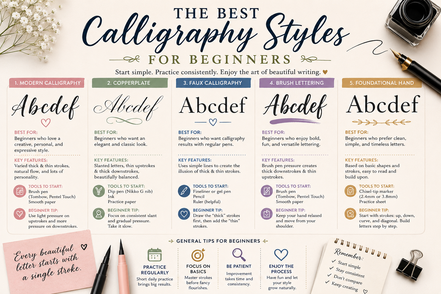


The best calligraphy style for beginners is Modern Calligraphy, because it uses forgiving brush pens instead of a dip nib, doesn’t require memorizing strict letterforms, and gives you a finished-looking result within your first practice session. If you prefer a more structured, classic look, Italic Script is the next-best starting point, since its logic (a fixed pen angle rather than pressure control) is easier to repeat consistently. Both styles build the muscle memory you’ll need before moving on to Copperplate, Spencerian, or Gothic scripts.
There are dozens of calligraphy styles worldwide, but almost every beginner question which calligraphy style is easiest, what are the different types of calligraphy, which calligraphy fonts should I learn first comes down to the same handful of scripts. This guide breaks down every major style, shows you real calligraphy alphabet examples for each, and gives you a simple framework for choosing the one that matches your goals, whether that’s wedding stationery, journaling, or building a business around live event calligraphy.
What Is Calligraphy, Exactly?
Calligraphy is the art of forming letters with intentional, controlled strokes, using tools that create variation between thick and thin lines. That variation is what separates calligraphy from ordinary handwriting or “hand lettering” (which is drawn, letter by letter, rather than written in continuous strokes).
Every calligraphy style shares three building blocks:
- The tool — a broad-edge nib, a pointed flexible nib, or a brush, each producing a different kind of line
- The letterform system — the specific shapes, slants, and proportions that define the script
- The pressure or angle system — how thick-thin contrast is created (pressure for pointed pen scripts, angle for broad-edge scripts)
Once you understand which of these three a style relies on, choosing between calligraphy styles for beginners becomes far less overwhelming.
The Main Types of Calligraphy Styles at a Glance
Here’s how the calligraphy alphabet families beginners ask about most often compare, side by side.
| Style | Tool | Difficulty | Best For | Learning Curve |
| Modern Calligraphy | Brush pen | Easiest | Event signage, journaling, gifts | 1–3 weeks to basics |
| Italic Script | Broad-edge/chisel pen | Easy–Moderate | Formal invitations, addressing envelopes | 2–4 weeks to basics |
| Faux Calligraphy | Any pencil or marker | Easiest (no special tools) | Practicing letterforms before investing in tools | Immediate |
| Brush Lettering | Brush pen | Easy | Bold signage, social content, florals | 1–2 weeks to basics |
| Copperplate | Pointed dip pen | Advanced | Wedding stationery, formal correspondence | Several months |
| Spencerian | Pointed dip pen | Advanced | Ornamental, business-script heritage pieces | Several months |
| Gothic (Blackletter) | Broad-edge pen | Moderate–Advanced | Dramatic, formal, or vintage-themed pieces | 6–10 weeks |
| Uncial / Foundational Hand | Broad-edge pen | Moderate | Building disciplined fundamentals | 4–8 weeks |
This is the short version of the comparison. If you want the complete history and letterform breakdown of each family, see our full guide to every major calligraphy style.
Calligraphy Styles Explained: A Closer Look at Each One
1. Modern Calligraphy (Best for Most Beginners)
Modern calligraphy breaks away from historical rules. Letters can bounce off the baseline, vary in height, and mix upright and slanted forms freely. It’s typically written with a brush pen (like a Tombow Fudenosuke or Dual Brush), which means there’s no dip pen, no ink-loading, and almost no learning curve for the tools themselves.
Because the “rules” are really just guidelines, modern calligraphy rewards experimentation rather than punishing small inconsistencies — which is exactly what makes it the most common answer to “what is the best calligraphy style for beginners.”
2. Italic Script
Italic is a broad-edge script built on a consistent pen angle (usually 45 degrees) rather than pressure control. Once you understand that single mechanical rule, the letterforms become far more predictable to reproduce than a pointed-pen script. It’s the classic entry point for anyone who eventually wants to learn Gothic, Uncial, or other broad-edge historical hands, since the pen-angle logic carries over.
3. Faux Calligraphy
Faux calligraphy uses an ordinary pencil, gel pen, or marker to simulate the look of calligraphy — you write the word normally, then go back and thicken the downstrokes by hand. It requires zero special tools, which makes it the fastest way to understand letterform structure before spending money on nibs or brush pens. Many instructors, including in our own beginner sessions, use faux calligraphy as the very first exercise.
4. Brush Lettering
Brush lettering is closely related to modern calligraphy but leans more expressive and bold, often used for social captions, signage, and florals rather than formal stationery. It uses the same brush pens as modern calligraphy, so most beginners end up practicing both simultaneously without realizing it.
5. Copperplate
Copperplate is a pointed-pen script with a strict slant angle (usually 55 degrees) and thick-thin contrast created entirely through hand pressure on a flexible dip nib. It’s the script most associated with “traditional” or “wedding” calligraphy, and it dominates the professional wedding stationery market alongside its modern derivatives. It is genuinely harder to learn than modern or italic — expect months, not weeks — because pressure control is a physical skill that takes repetition to build.
If you’re deciding between the two most-requested traditional scripts, our Copperplate vs Italic comparison breaks down exactly which one to learn first based on your goals.
6. Spencerian
Spencerian is Copperplate’s American cousin — same pointed-nib mechanics, lighter overall pressure, and more delicate shading rather than dramatic thick-thin contrast. It’s slightly more approachable than Copperplate for that reason, though it still demands quality tools and smooth paper to look right.
7. Gothic (Blackletter)
Gothic scripts, including Textura and Fraktur, use a broad-edge pen and dense, angular letterforms. They suit dark, dramatic, or maximalist aesthetics — think black envelope wedding suites, letterpress invitations, or deep-color stationery. With 20–30 minutes of consistent daily practice, most beginners develop recognizable Gothic letterforms within six to ten weeks. For the full history and step-by-step breakdown, see our complete Gothic calligraphy guide.
8. Uncial and Foundational Hand
Foundational hand is what most calligraphy schools teach first, even before modern or italic, because it builds controlled, intentional mark-making that transfers to every other broad-edge script you learn afterward. Calligraphers who skip it often develop inconsistent habits that limit their range later on.
Calligraphy vs. Hand Lettering: Another Common Mix-Up
Alongside “calligraphy fonts vs. calligraphy styles,” beginners often ask how calligraphy differs from hand lettering. The distinction matters because it affects which skill you’re actually trying to build.
- Calligraphy is written in continuous, practiced strokes using a single tool pass per letter shape. The thick-thin contrast comes from the tool and technique, not from going back over the letter.
- Hand lettering is drawn. Letters are sketched, outlined, and often filled in — closer to illustration than penmanship. Faux calligraphy actually sits in between the two, since it starts as ordinary writing and is then “thickened” by hand.
If your goal is speed and a consistent hand you can eventually write quickly, calligraphy is the skill to build. If your goal is highly custom, illustrative lettering for a single piece (a sign, a poster, a logo), hand lettering gives you more creative control per letter, at the cost of speed.
Choosing a Calligraphy Style by Goal
Beyond the general modern-vs-italic recommendation, here’s how the choice shifts depending on what you’re actually trying to accomplish.
If you want to address wedding invitations or build a stationery hobby: Start with italic to build pen-angle discipline, then move into Copperplate once your foundational strokes are consistent. Skipping straight to Copperplate without that foundation is the single most common reason beginners give up on it.
If you want quick, shareable results for social media or journaling: Modern calligraphy or brush lettering will get you a polished-looking result within days, not months, and the tools (a $6–15 brush pen) are the lowest-commitment entry point in this entire guide.
If you’re learning with kids, or want a style that’s forgiving of shaky hands: Faux calligraphy or brush calligraphy are the most forgiving starting points, since neither depends on fine pressure control the way a dip pen does. Our guide to kids’ calligraphy courses in Florida breaks down age-appropriate style choices in more detail.
If you’re building toward event or business calligraphy work: You’ll eventually want fluency in more than one style — modern for live, fast personalization, and a traditional script like Copperplate or Spencerian for formal commissions. Compare the two learning paths in our modern vs. traditional calligraphy courses guide.
If you’re just starting out and want the lowest-risk way to learn as a Florida beginner: See our full breakdown of the best way to learn calligraphy in Florida for beginners, including in-person workshops, online courses, and what to look for in an instructor.
A Brief History Behind the Styles Beginners Ask About Most
Understanding where these scripts came from makes the letterforms easier to remember, since the shapes usually reflect the tool and purpose they were built for.
- Italic developed in Renaissance Italy as a faster, more compact alternative to the heavier Gothic hands used for formal manuscripts — which is exactly why its letterforms feel quicker to write today.
- Copperplate takes its name from the copper printing plates 18th-century engravers used to reproduce elegant handwriting for mass printing, which is why its letterforms look almost mechanically uniform.
- Spencerian was developed in the United States in the mid-1800s as America’s standard business penmanship, decades before typewriters existed — its lighter pressure system was designed for speed across long documents.
- Gothic (Blackletter) scripts trace back to medieval European manuscripts, where dense, angular letterforms let scribes fit more text onto expensive parchment.
- Modern calligraphy is, by contrast, a genuinely recent development — a 20th and 21st-century departure from all of the above that deliberately treats historical rules as optional.
Knowing this context also explains why modern calligraphy feels so different to learn: it’s the only major style on this list that wasn’t designed around a specific historical constraint, which is exactly why it has the most forgiving learning curve.
International Interest: Calligraphie, Kalligrafie & Kalligraphie
Calligraphy is a genuinely global search interest — beginners look this topic up as “calligraphie” in French, “kalligrafie” in Dutch, “kalligraphie” in German, and “каллиграфия” in Russian, among many others. The underlying styles covered in this guide (modern, italic, Copperplate, Gothic) are largely the same Western scripts referenced across these languages, since most Western calligraphy traditions share the same Latin-alphabet roots regardless of the learner’s native language. If you’re traveling to Florida or working remotely with an English-speaking instructor, the vocabulary in this guide — modern, italic, Copperplate, Gothic, brush lettering — is the same terminology you’ll encounter in an in-person or virtual workshop.
Calligraphy Fonts vs. Calligraphy Styles: What’s the Difference?
This is one of the most common points of confusion beginners have, and it’s worth clearing up directly.
- A calligraphy style (or “hand”) is a written script — a physical set of rules for how letters are formed by hand, using a specific tool and technique. Modern, Copperplate, and Gothic are styles.
- A calligraphy font is a digital typeface designed to imitate the look of a calligraphy style on a screen or in print. Fonts are typed, not written, and don’t require any pen skill at all.
If you’re searching for calligraphy fonts because you need something for a logo, invitation template, or digital design, a font is the right tool. If you want to actually develop the skill of hand lettering, learning a calligraphy style — starting with modern or italic — is what will get you there. Many beginners start with fonts to understand what a style should look like, then transition into learning the real script by hand.
Which Calligraphy Style Is Best for Beginners? Head-to-Head
| Comparison | Modern Calligraphy | Italic Script |
| Tool cost | Low ($5–15 for a brush pen) | Low–moderate ($15–30 for a pen set) |
| Time to first legible alphabet | 1–2 sessions | 2–3 sessions |
| Forgiveness of mistakes | High | Moderate |
| Best next step | Brush lettering, then Copperplate | Foundational hand, then Gothic or Uncial |
| Ideal use case | Gifts, journaling, event signage, social content | Formal invitations, envelope addressing |
If you genuinely cannot decide, this is the simplest possible rule: choose modern calligraphy if you want fast, forgiving results; choose italic if you want a structured foundation that opens the door to historical scripts later. Trying to learn two styles at the same time isn’t recommended for beginners – the technical demands differ enough to create conflicting habits, so build a solid foundation in one script before introducing a second.
How to Choose Your First Calligraphy Style: 3 Filters
With so many calligraphy styles available, the decision gets much simpler once you filter by these three questions.
- What do you actually want to make? Wedding stationery and formal correspondence favor Copperplate and its modern derivatives. Everyday journaling, gift tags, and social content favor modern calligraphy or brush lettering.
- How much time can you commit weekly? Even 15–20 minutes of daily practice outperforms occasional long sessions. If you only have a few minutes a day, modern calligraphy’s shorter learning curve will keep you motivated. If you can commit to structured weekly practice, Copperplate or Gothic becomes realistic.
- Do you prefer rules or freedom? Traditional scripts like Copperplate follow strict historical guidelines. Modern calligraphy treats those rules as optional. Neither is more “correct” — it’s a matter of what keeps you practicing.
How to Learn Calligraphy Step by Step
- Start with faux calligraphy. Spend your first session simulating the look of calligraphy with a regular pen, so you understand letterform structure before investing in tools.
- Pick one style and one tool. Based on the filters above, commit to either a brush pen (modern) or a broad-edge pen (italic) — not both.
- Master basic strokes before letters. Every script is built from a handful of repeated strokes: upstrokes, downstrokes, ovals, and compound curves. Drilling these for several sessions before attempting full letters will save you weeks of frustration later.
- Learn the lowercase alphabet first. Uppercase letters are typically more ornamental and easier once your muscle memory is established. Our letter-by-letter beginner alphabet guide walks through the exact stroke order for each letter.
- Practice with guide sheets. Printable or purchased calligraphy guide sheets keep your slant and baseline consistent while your hand builds discipline — a shortcut most self-taught beginners skip and later regret.
- Apply your skill to a real, small project. A gift tag or a single greeting card gives your practice purpose and shows you where your technique still needs work.
- Get feedback from a real person. Online tutorials are useful for repetition, but in-person feedback catches pressure, angle, and posture issues that are almost impossible to self-diagnose from a video. If you want to fast-track past the guesswork, book a beginner calligraphy workshop with Carla for hands-on correction from day one.
Consistency beats intensity here: short, regular drills build the muscle memory that calligraphy depends on far more effectively than sporadic long sessions.
Calligraphy Alphabet Basics for Beginners
Before attempting full words, every beginner should be able to produce five foundational strokes cleanly:
- Upstroke — thin line, made with minimal pressure, moving upward
- Downstroke — thick line, made with added pressure, moving downward
- Oval — the base shape behind letters like a, o, d, and g
- Overturn and underturn curves — the connecting shapes between letters
- Compound curve — used in letters like m, n, and v
Once these five are consistent, most of the lowercase calligraphy alphabet becomes a matter of combining familiar shapes rather than learning 26 new ones from scratch. Our full calligraphy alphabet guide covers stroke order letter by letter if you want to go deeper here.
Best Calligraphy Tools and Sets for Beginners
Individual, targeted purchases are usually better value than bundled beginner sets, which often include redundant items and lower-quality components. Match your tools to the style you’ve chosen:
- For modern calligraphy or brush lettering: a Tombow Fudenosuke (hard tip, more control) or a set of dual brush pens
- For italic or foundational hand: a broad-edge calligraphy marker or fountain pen with an italic nib
- For Copperplate or Spencerian: a pointed dip pen with a flexible nib (the Nikko G is the most widely recommended beginner nib in the calligraphy community), a straight or oblique pen holder, and calligraphy ink
- For everyone starting out: smooth, bleed-resistant practice paper — cheap printer paper will fight against your technique no matter how good your pen is
For a fully tested, ranked breakdown across pointed pens, brush pens, and fountain pens at every budget, see our complete guide to the best calligraphy pens for beginners.
Common Mistakes Beginners Make When Choosing a Calligraphy Style
- Trying to learn two styles at once. This is the single most common cause of stalled progress — the conflicting muscle memory slows down both scripts.
- Skipping basic strokes to jump straight to letters. Letters built on shaky strokes will always look shaky, no matter how much you practice the letters themselves.
- Choosing a style based on how it looks finished, not how it feels to learn. Copperplate looks stunning in a finished wedding suite, but it’s a poor first style if you’re not ready for a months-long learning curve.
- Using low-quality or mismatched tools. A brush pen used for a pointed-pen script (or vice versa) will fight your technique regardless of your skill level.
- Practicing without guide sheets. Freehand practice without guidelines makes it far harder to notice — and correct — slant and baseline inconsistencies early.
Troubleshooting: Why Your Calligraphy Doesn’t Look Right Yet
A few quick diagnostics for the most common beginner frustrations, regardless of which style you’ve chosen.
- Letters look shaky or inconsistent: This is almost always a strokes problem, not a letters problem. Go back to isolated upstroke and downstroke drills for a few sessions before returning to full letters.
- Thick-thin contrast isn’t showing up: For pointed-pen scripts (Copperplate, Spencerian), you likely need more pressure variation between up and down strokes. For broad-edge scripts (italic, Gothic), check that you’re holding a consistent pen angle — a shifting angle flattens the contrast.
- Letters lean inconsistently: Use a guide sheet with slant lines. Freehand slant consistency is one of the hardest things to self-correct without a visual reference.
- Ink is skipping or feathering: This is usually the paper, not your technique. Smooth, bleed-resistant paper (not standard printer paper) solves this in almost every case.
- You’ve plateaued despite regular practice: This is the point where in-person feedback typically saves weeks of trial and error, since a trained eye can spot pressure, angle, or posture issues a self-taught beginner won’t notice in their own work.
Frequently Asked Questions
There are dozens of named calligraphy styles worldwide, but for beginners they fall into a manageable handful: modern calligraphy, italic, faux calligraphy, brush lettering, Copperplate, Spencerian, Gothic (Blackletter), and foundational/Uncial hand.
Modern calligraphy is the easiest starting point because it uses a forgiving brush pen and doesn’t require mastering strict letterforms. Italic is the best second choice if you prefer a more structured, classic look.
Modern calligraphy and faux calligraphy are the easiest, since neither requires precise pressure control or a dip pen. Both can produce a legible, attractive result within your first one or two practice sessions.
A calligraphy style is a hand-written script formed with a pen or brush. A calligraphy font is a digital typeface designed to imitate that look on a screen, without requiring any hand-lettering skill.
You can absolutely start self-taught with faux calligraphy and online stroke tutorials. However, in-person feedback catches pressure, angle, and posture problems far faster than self-study alone, which is why most self-taught beginners eventually plateau without a session or two of live correction.
Basic, legible strokes and letters in an easier style like modern calligraphy typically take one to three weeks of regular short practice sessions. Traditional pointed-pen scripts like Copperplate take several months to reach a similarly confident level. For a full breakdown by style, see our honest calligraphy learning timeline.
Copperplate and its modern derivatives dominate professional wedding stationery, though Spencerian and various modern scripts are also used depending on the couple’s overall aesthetic direction.
No. Faux calligraphy needs nothing but a pencil or marker you already own, and a single brush pen (under $15) is enough to start modern calligraphy or brush lettering. Save the investment in dip pens and inks for once you’ve decided a pointed-pen script is worth pursuing.
Not the entry-level styles. Modern calligraphy and faux calligraphy are approachable for complete beginners within their first few sessions. Traditional scripts like Copperplate and Gothic are genuinely more difficult and reward patience over quick results.
Short, consistent daily sessions (15–20 minutes) using printed guide sheets outperform long, irregular practice sessions. Focus on basic strokes before attempting full alphabets, and apply your skill to a small real project as soon as your letters are legible.
Calligraphy is written in continuous, practiced strokes with a single tool pass per letter. Hand lettering is drawn and outlined, closer to illustration than penmanship, which gives more per-letter creative control but sacrifices writing speed.
Yes, and often faster. Adults typically bring more focus and patience to deliberate practice, while children adapt quickly to playful, forgiving styles like brush or faux calligraphy. Age matters far less than consistent practice time.
Whether you’re drawn to the freedom of modern calligraphy or the elegance of Copperplate, the fastest way to move past guesswork is real-time, hands-on feedback. Book a beginner-friendly calligraphy workshop with Carla and get personalized guidance on exactly the style that fits your goals — or explore custom calligraphy services if you’re planning an event and want the artistry done for you.