

Staring at a calligraphy alphabet chart and not knowing where to start is one of the most common reasons beginners give up in week one. The letters look beautiful, but nobody explains how they’re actually built.
A calligraphy alphabet isn’t memorized like regular handwriting. Every letter is constructed from a small set of repeating strokes, and once you learn those strokes, the entire alphabet becomes far less intimidating.
This guide walks through the foundational strokes behind every major calligraphy style, breaks the alphabet into manageable letter groups, and shows you exactly how to practice so your letterforms become consistent rather than random.
Why Calligraphy Letters Aren’t Like Handwriting
Regular handwriting is fast and automatic. Calligraphy is deliberate, and that’s the biggest mental shift beginners need to make before the alphabet starts making sense.
Every calligraphy letter, regardless of style, is built from a handful of basic strokes repeated and combined in different ways. Once you can draw an oval, an upstroke, a downstroke, and a connecting line cleanly, you already have the building blocks for most of the alphabet.
This is why instructors almost universally recommend drilling individual strokes before attempting full letters, and full letters before attempting words. Skipping straight to writing your name usually produces inconsistent results that feel discouraging.
Understanding this stroke-based foundation changes how you approach the entire alphabet, so let’s start with the strokes themselves.
The Basic Strokes Behind Every Letter
Before you touch a single letterform, your hand needs to understand pressure. In pointed-pen styles like modern calligraphy and Copperplate, downstrokes are thick and upstrokes are thin, created entirely through how much pressure you apply to the nib.
The Seven Foundational Strokes
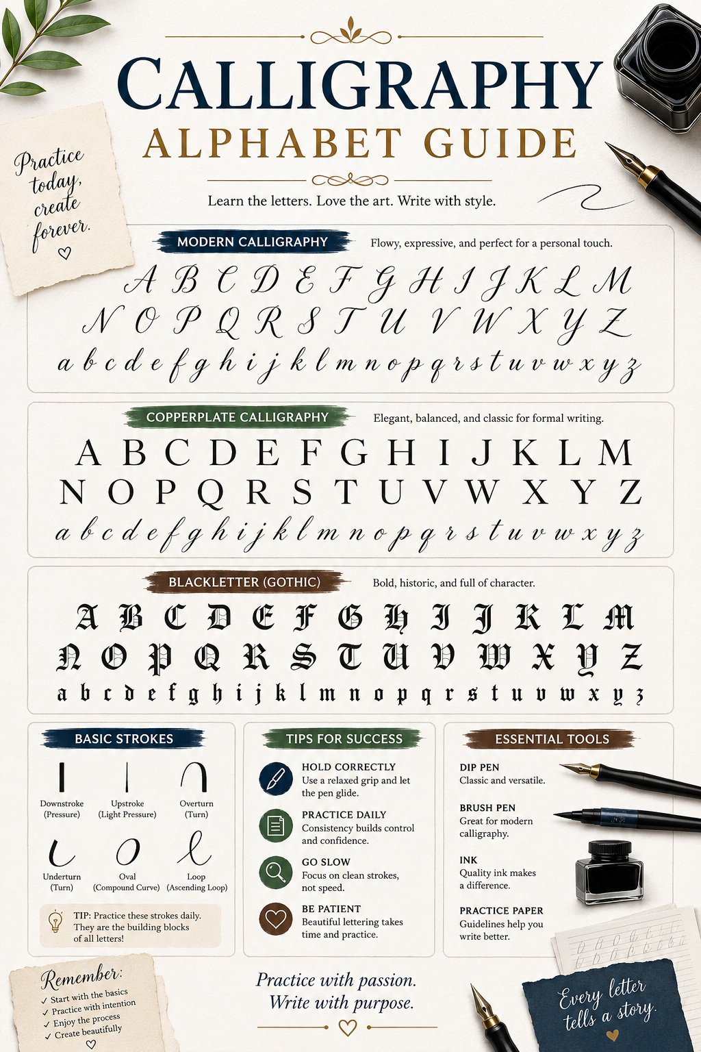
Most calligraphy alphabets, across styles, are built from these core shapes: the upstroke, the downstroke, the underturn, the overturn, the compound curve, the oval, and the ascending or descending loop.
Practicing these as standalone drills, in rows, before attempting letters is the single most effective way to build consistency. It feels repetitive, but it’s the same principle behind any hand skill, similar to how musicians drill scales before playing songs.
Why Pressure Control Comes First
If your downstrokes and upstrokes aren’t visually distinct yet, full letters will look uneven no matter how carefully you trace the shape. Spend at least your first week purely on pressure drills before moving to lettered practice sheets.
Once pressure control feels natural, you’re ready to start grouping these strokes into actual letterforms, which is where most alphabet guides start, but skipping straight here is exactly what trips beginners up.
Lowercase Letters: Grouped by Shape, Not Alphabetical Order
Most calligraphy instructors don’t teach the alphabet in A-B-C order, and for good reason. Letters share underlying shapes, and grouping them by shared strokes builds muscle memory far faster than working alphabetically.
Group One: Oval-Based Letters (a, c, d, g, o, q)
These letters all begin with the same oval shape you practiced in your basic strokes. Once your oval is consistent, adding the small connecting stroke that turns it into an “a” or “d” becomes straightforward.
Practice this group together so your hand learns one shape and applies it six different ways, rather than treating each letter as unrelated.
Group Two: Underturn Letters (i, u, t, w)
These letters share a rounded bottom-turn stroke. The underturn is one of the seven foundational strokes mentioned earlier, and this letter group is essentially that stroke repeated with small variations in height or added crossbars.
Group Three: Overturn Letters (n, m, v, x, y)
Overturn letters use the same compound curve, just oriented differently than the underturn group. Many beginners find this group slightly harder since the stroke direction feels less intuitive at first.
Group Four: Loop Letters (b, f, h, j, k, l, e)
Ascending and descending loops define this group. These letters tend to take longer to feel natural because the loop requires consistent width and slant across both the up and down portion of the stroke.
Group Five: Standalone Letters (p, r, s, z)
A few letters don’t fit neatly into the groups above and benefit from individual attention once the other groups feel comfortable.
Working through lowercase letters in these shape-based groups, rather than alphabetically, is one of the fastest ways to build a consistent hand. Once lowercase letters feel steady, capital letters introduce a different challenge entirely.
Uppercase Letters: A Different Set of Rules
Capital letters in calligraphy are often more ornamental and structurally different from their lowercase counterparts, especially in scripts like Copperplate.
Why Capitals Are Harder for Beginners
Uppercase letters frequently include flourishes, loops, and entry strokes that don’t appear in lowercase forms. Beginners often try to add these decorative elements too early, before the basic letter shape itself is consistent.
A more effective approach is mastering the plain capital letterform first, then layering in flourishes once the underlying structure feels stable. Rushing the decorative elements is one of the most common reasons capital letters end up looking shaky compared to lowercase work.
Practicing Capitals in Context
Capitals look different in isolation than they do at the start of a word. Once you’ve drilled a capital letter on its own, practice it directly connected to the lowercase letters that typically follow it, since spacing and transition strokes change how the whole word reads visually.
With both lowercase and uppercase letters covered, the next major decision is which calligraphy style’s alphabet you’re actually building toward, since the letterforms themselves shift meaningfully between scripts.
How the Alphabet Changes Across Styles
The seven foundational strokes apply broadly, but the finished letterforms look noticeably different depending on which style you’re learning. If you’re still deciding between styles, this breakdown of the best calligraphy style for beginners walks through how each one suits different goals and skill levels.
Modern Calligraphy Alphabet
Modern calligraphy allows the most letterform flexibility. Loops can be exaggerated or minimized, slant can vary slightly between letters, and there’s no single “correct” version of any letter as long as the thick-thin contrast stays consistent.
This flexibility makes modern calligraphy’s alphabet the most forgiving to learn, since small inconsistencies read as stylistic choice rather than error.
Copperplate Alphabet
Copperplate demands far more precision. Letters follow a consistent 55-degree slant, strict x-height proportions, and specific entry and exit stroke rules for every single letter.
This precision is exactly why Copperplate remains the standard for formal wedding stationery and traditional event work, the kind highlighted in this feature on a luxury wedding calligraphy experience for Giorgio Armani’s collection, where letterform consistency directly reflects on the finished product’s quality.
Italic Alphabet
Italic letters are built with a broad-edge pen held at a consistent angle, which means the alphabet’s thick and thin contrast comes from pen angle rather than pressure. The letterforms themselves are more geometric and upright compared to the flowing slant of Copperplate.
Each style’s alphabet rewards slightly different practice habits, which is exactly what your practice routine should account for next.
Building a Practice Routine That Actually Works
Knowing the strokes and letter groups isn’t enough on its own. How you structure your practice sessions determines how quickly your alphabet becomes consistent.
Short, Frequent Sessions Beat Long, Rare Ones
Fifteen to twenty minutes of focused practice, three to four times a week, typically produces better results than one long two-hour session once a week. Hand skills build through frequent, low-fatigue repetition rather than marathon sessions.
Use Tracing Before Freehand Practice
Tracing printed letterform guides for your first few sessions trains your hand to recognize correct proportions before you’re asked to recreate them from memory. Most calligraphy workbooks and online courses build their early lessons around this exact tracing-to-freehand progression.
Practice Letters in Words, Not Isolation Forever
Once individual letters feel steady, shift practice toward short words rather than continuing to drill single letters indefinitely. Letter spacing and connecting strokes only become visible problems once letters sit next to each other.
A structured routine like this is exactly what separates beginners who plateau from those who see steady, visible improvement, and it’s a major reason many learners eventually move from self-teaching to guided instruction.
Self-Teaching vs Structured Instruction
The alphabet is learnable from books and video tutorials alone, but most beginners progress meaningfully faster with some form of structured feedback, even occasionally.
What Self-Teaching Gets Right
Self-teaching is flexible, low-cost, and lets you practice at your own pace without scheduling around a class. For motivated beginners with strong attention to detail, it’s a completely viable path.
Where Structured Instruction Helps Most
The biggest gap in self-teaching is angle and pressure correction. A worksheet can’t tell you that your nib angle is off by ten degrees, but an instructor can spot that instantly. This guide comparing online versus in-person calligraphy classes breaks down which format suits different learning styles, and this overview of in-person versus online calligraphy courses goes deeper into cost and pacing differences between the two. You can also explore the private and group instruction options available directly through carlaschall.com if hands-on correction is what your alphabet practice needs most.
If budget is part of your decision, it’s worth reviewing this calligraphy course cost breakdown before committing to either path, since pricing varies significantly between weekend workshops and ongoing private lessons.
Whether you’re self-teaching or working with an instructor, the materials you practice on matter just as much as the method.
Tools and Materials for Alphabet Practice
The right paper and ink make a measurable difference in how your letterforms turn out, especially in your first few weeks.
Paper Matters More Than Beginners Expect
Standard printer paper causes ink to feather and bleed, which makes your letterforms look inconsistent even when your hand technique is improving. Smooth, low-tooth paper like Rhodia or HP 32lb keeps lines crisp while you’re still building control.
Choosing Your First Pen or Nib
Pointed-pen styles need a flexible nib like a Nikko G, paired with a straight or oblique holder depending on the style’s required slant. Broad-edge styles like Italic work better with a chisel-tip marker or fountain pen, which simplifies setup considerably for beginners.
A complete rundown of what to buy first, and what’s safe to skip initially, is available in this guide to calligraphy supplies for beginners.
Practice Sheets and Guides
Lined practice sheets with slant guides remove a huge amount of guesswork for new learners, since they show you exactly where ascenders, x-height, and descenders should land. Many free and paid worksheet sets are built specifically around the letter groupings covered earlier in this guide.
With the right tools and a stroke-based practice routine in place, the final piece is knowing what progress should realistically look like over time.
Realistic Progress Milestones
Calligraphy alphabets take longer to master than most beginners expect going in, and knowing what’s normal at each stage helps prevent unnecessary discouragement.
Weeks One to Two
Expect your strokes to feel stiff and your pressure control to be inconsistent. This is normal and doesn’t indicate the wrong technique, just early muscle memory development.
Weeks Three to Six
Letterforms within shape groups should start looking noticeably more consistent. Capitals will likely still feel shakier than lowercase letters at this stage, which is expected given their added complexity.
Month Two and Beyond
Full alphabets should feel comfortable enough to write short words and phrases with reasonable consistency. A detailed breakdown of what separates this hobbyist stage from commission-ready skill is covered in how long it actually takes to master calligraphy, and once you reach that stage, the live event and commission work showcased through carlaschall.com offers a real benchmark for what client-ready lettering looks like.
Understanding these milestones helps you measure progress against a realistic timeline rather than comparing your week-two practice sheets to a professional’s finished wedding suite.
Bringing the Alphabet Together
Learning a calligraphy alphabet isn’t about memorizing twenty-six isolated shapes. It’s about mastering a small set of foundational strokes and learning how those strokes recombine across oval letters, underturns, overturns, loops, and capitals.
Group your practice by shared shapes rather than alphabetical order, prioritize pressure control before decorative flourishes, and give your hand consistent, short practice sessions rather than rare long ones. The alphabet that looked overwhelming on day one becomes genuinely manageable within a few focused weeks.
Pick up your pen, start with a single stroke, and let the rest of the alphabet build from there one confident letter at a time.
FAQ
No. Most instructors recommend grouping letters by shared strokes and shapes instead, since this builds muscle memory faster than working through the alphabet alphabetically.
Capitals often include flourishes and entry strokes not found in lowercase forms, making them structurally more complex. Mastering the plain capital shape before adding decoration usually resolves this.
Most calligraphy alphabets, across styles, are built from seven foundational strokes: upstrokes, downstrokes, underturns, overturns, compound curves, ovals, and ascending or descending loops.
Pencil practice can help with letterform shape, but it won’t teach pressure control, which is essential for thick-thin contrast. Practicing directly with your intended pen or nib is generally more effective.
Generally yes. Copperplate requires strict slant angles and proportions for every letter, while modern calligraphy allows more natural variation, making it a more forgiving starting alphabet for most beginners.
Ready to turn these strokes into a confident, consistent hand?
Carlaschall.com offers structured calligraphy instruction designed to take you from your first stroke drill to a polished alphabet, with real feedback at every step.