


Spencerian and copperplate are two of the most admired pointed pen scripts in Western calligraphy, and they are frequently confused with each other, even by experienced enthusiasts. Both use flexible pointed nibs. Both produce elegant letters with thick and thin contrast. Both occupy a prestigious position in the history of American and European penmanship.
But they are not the same script, and they are not equally suited to every calligrapher, purpose, or aesthetic direction. Understanding the genuine differences between Spencerian vs copperplate is essential before committing your time, tools, and practice energy to one of them.
A Brief History of Each Script
Understanding where each script came from clarifies what it was designed to do, which in turn explains why they look and feel different to write.
The Origins of Copperplate
Copperplate developed from the Italian cancelleresca script of the 16th century as professional engravers adapted pen-written letterforms for reproduction on copper printing plates. The extreme thick-thin contrast of copperplate emerged partly because engravers had to exaggerate the stroke variation to make it read clearly in print.
By the 18th century, copperplate (also called English roundhand) was the dominant formal penmanship style across Europe and was used for official correspondence, legal documents, and formal invitations. Its prestige was immense. Mastering copperplate was a sign of education, professional competence, and social refinement.
The Origins of Spencerian
Spencerian script was developed by Platt Rogers Spencer in the mid-19th century as a practical everyday writing system for American commercial and personal correspondence. Spencer’s system was published in a series of copybooks starting in 1848 and was subsequently adopted in schools across the United States as the standard business hand.
Spencerian was designed with accessibility in mind. Spencer wanted a script that was beautiful, consistent, and teachable to the general population rather than reserved for professional scribes. This democratic intent shaped every aspect of the script’s construction.
Visual and Aesthetic Differences
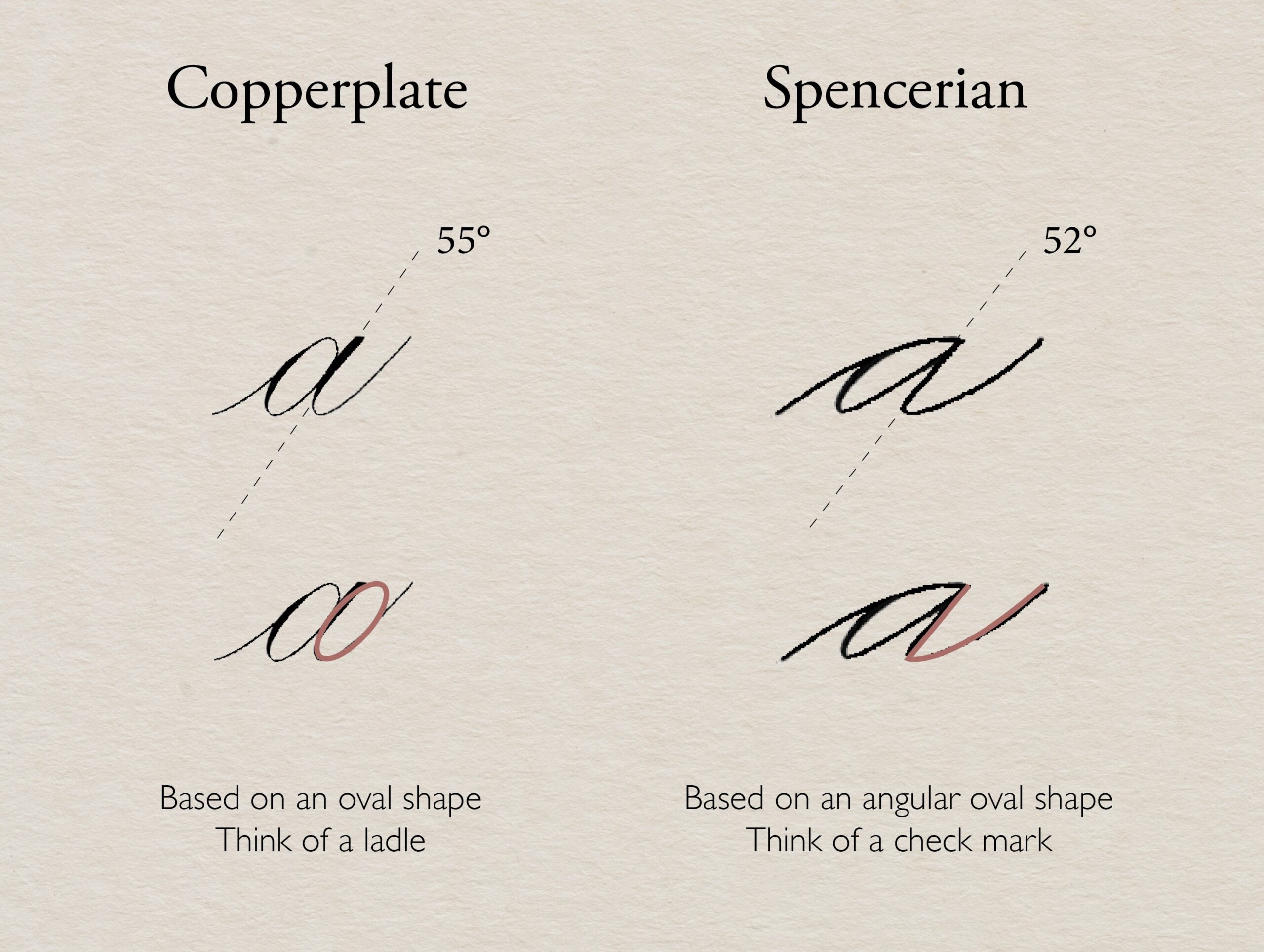
The most important thing to understand aesthetically is that copperplate is bolder and more dramatic, while Spencerian is lighter and more lyrical.
Copperplate’s Visual Character
Copperplate is defined by pronounced thick-thin contrast. Downstrokes are weighted and lush, sometimes several times the width of the hairline upstrokes. This dramatic variation gives copperplate a rich, formal beauty that photographs exceptionally well in high-contrast black-and-white imagery.
The letters are upright-to-moderately slanted (typically 52 to 55 degrees) with elaborate loops and swells on ascenders and descenders. Decorative flourishes are a natural and expected part of formal copperplate work, particularly in uppercase letters and envelope addressing.
Spencerian’s Visual Character
Spencerian is considerably lighter in weight. The script relies on delicate ovals, gentle shading rather than dramatic thick strokes, and a rhythmic consistency that prioritizes elegance over drama. The overall impression is airy and graceful rather than rich and weighty.
This lightness comes from Spencerian’s structural philosophy: the script uses what penmanship teachers call “main shade” on downstrokes, but the pressure required is substantially less than copperplate. Many Spencerian letters are written with almost no pressure at all, creating continuous hairline strokes punctuated by subtle shading on oval curves and descending strokes.
Technical and Mechanical Differences
Beyond aesthetics, Spencerian and copperplate differ in their mechanical demands, and those differences have practical implications for learners.
Pressure Requirements
Copperplate requires active, controlled pressure on downstrokes to open the nib tines and create broad strokes. The pressure is then fully released on upstrokes to produce hairline marks. This pressure cycle, applied repeatedly through every letterform, demands considerable finger control and nib awareness.
Spencerian uses significantly less pressure overall. The nib barely opens on most strokes. This reduced pressure requirement makes Spencerian more forgiving on nibs (they last longer) and somewhat more accessible for learners who struggle with the pressure dynamics of copperplate.
However, Spencerian’s lightness introduces its own challenge: consistency. When you are working with very subtle shading and minimal pressure variation, any inconsistency in your touch becomes immediately visible. Spencerian mistakes look like hesitation; copperplate mistakes look like imbalance. Both are problems, but they require different corrections.
Nib Selection
Both scripts use pointed flexible nibs, but their specific requirements differ. Copperplate benefits from nibs with significant flexibility to produce dramatic shade-and-hairline contrast. The Nikko G, Hunt 101, and Leonardt Principal are all popular copperplate nibs.
Spencerian traditionally uses finer, slightly stiffer nibs than copperplate. The Gillott 303 and Esterbrook 048 are classic Spencerian nib choices. These nibs open less easily, which supports the lighter touch Spencerian demands. Using a highly flexible copperplate nib for Spencerian often results in over-shaded strokes that look too heavy.
Letter Proportions
Copperplate letterforms are typically rounder and more oval-based, with proportions that emphasize the body of the letter relative to ascenders and descenders. Spencerian letterforms are narrower, with relatively taller ascenders and longer descenders that give the script its characteristic vertical rhythm.
This proportional difference is immediately visible when both scripts are compared side by side, even when written at the same size.
Which Is More Beginner-Friendly?
This question does not have a single clean answer, but the nuances are instructive.
Spencerian’s lower pressure requirement means fewer nib-related disasters in early practice. You are less likely to spray ink, tear paper, or bend a nib in your first few Spencerian sessions than in your first copperplate sessions.
However, Spencerian’s letterforms are in some ways more technically precise. The consistent oval shapes, the specific letter proportions, and the subtle shading require disciplined practice and careful attention to model. Getting Spencerian to look good is not necessarily easier than copperplate. It is just different in where the difficulty lives.
Many calligraphy instructors who teach both scripts recommend starting with copperplate’s foundational oval and pressure mechanics first, then transitioning to Spencerian once your pressure control is calibrated. The logic is that copperplate teaches you to feel the nib’s flexibility, and once you have that sensitivity, learning to reduce your pressure for Spencerian becomes a more conscious and controllable adjustment.
For those weighing whether to start with copperplate or italic as a first script, the same general principles apply. Build foundational mechanics first, then develop expressive range.
Applications: Where Each Script Shines
Copperplate in Professional Use
Copperplate dominates professional wedding stationery, formal correspondence, and luxury event calligraphy. Its dramatic visual presence makes it the default choice for contexts requiring elegance and formality.
Live event calligraphy, envelope addressing, bespoke invitations, and high-end corporate gift personalization all tend toward copperplate or its modern derivatives. Professionals who work in these markets invest heavily in copperplate mastery.
Spencerian in Contemporary Use
Spencerian occupies a more specialized contemporary niche. It is favored by penmanship enthusiasts, historical calligraphy practitioners, and those who love the romantic, 19th-century American aesthetic.
Its delicacy makes it less suitable for large-scale work or situations where letters need to read clearly from a distance. But for personal correspondence, journal covers, refined gift inscriptions, and intimate stationery, Spencerian has a romantic lightness that copperplate cannot replicate.
The real impact of handwritten personalization on the overall experience of receiving something crafted by hand applies to both scripts, but in distinctly different emotional registers.
Spencerian vs Copperplate: The Decision Framework
If you want to build a professional calligraphy practice in wedding and event markets, copperplate is the more direct and commercially relevant starting point. Its market presence is dominant, and your investment in learning it will be repaid by client demand.
If you are drawn to calligraphy as a personal art practice, historical study, or refined correspondence craft, Spencerian offers a unique and genuinely beautiful alternative. Its lighter aesthetic and democratic historical origins give it a different kind of appeal than the formal grandeur of copperplate.
If you plan to practice both, which most serious calligraphers eventually do, starting with copperplate and adding Spencerian after six to twelve months of pointed pen practice is the path most frequently recommended by professional instructors.
Understanding how long it actually takes to master calligraphy at a professional level provides useful context for planning your learning journey across both scripts.
FAQ
Technically yes, but ideally no. Copperplate benefits from more flexible nibs that open easily under pressure. Spencerian works better with finer, slightly stiffer nibs that resist excessive opening. Using a flexible copperplate nib for Spencerian often results in over-shaded strokes.
In its historical application, Spencerian was designed for faster commercial correspondence and is structurally more fluid than formal copperplate. However, in deliberate artistic practice at similar writing speeds, neither script is significantly faster than the other.
Copperplate and its modern derivatives are more widely recognized in contemporary culture through their use in wedding stationery, greeting cards, and typography. Spencerian is less immediately recognized by the general public despite its historical ubiquity.
Yes. Spencerian has a dedicated community of practitioners, particularly in the United States, who study the original Spencer copybooks and historical examples. Michael Sull is one of the most respected contemporary Spencerian practitioners and has written extensively on the subject.
Yes. While less commonly requested than copperplate, Spencerian is a beautiful and appropriate choice for wedding stationery, particularly for couples who prefer a lighter, more delicate aesthetic. Discuss the option with your calligrapher during the initial consultation.
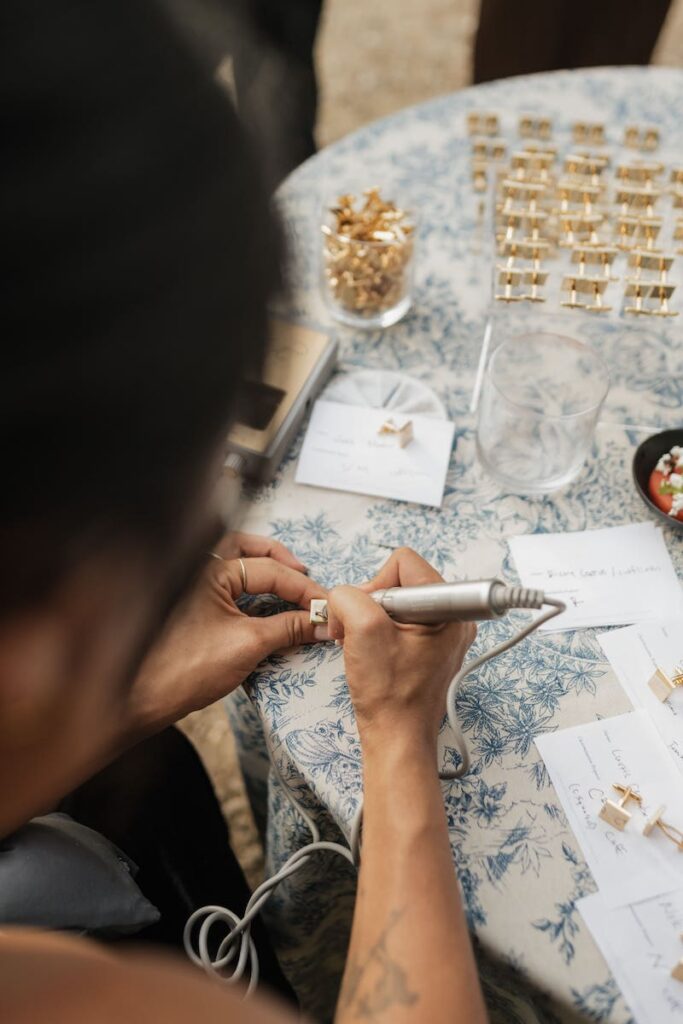
Learn both Spencerian and copperplate scripts in person with Carla in a Florida calligraphy workshop designed for pointed pen beginners. Book your place at carlaschall.com