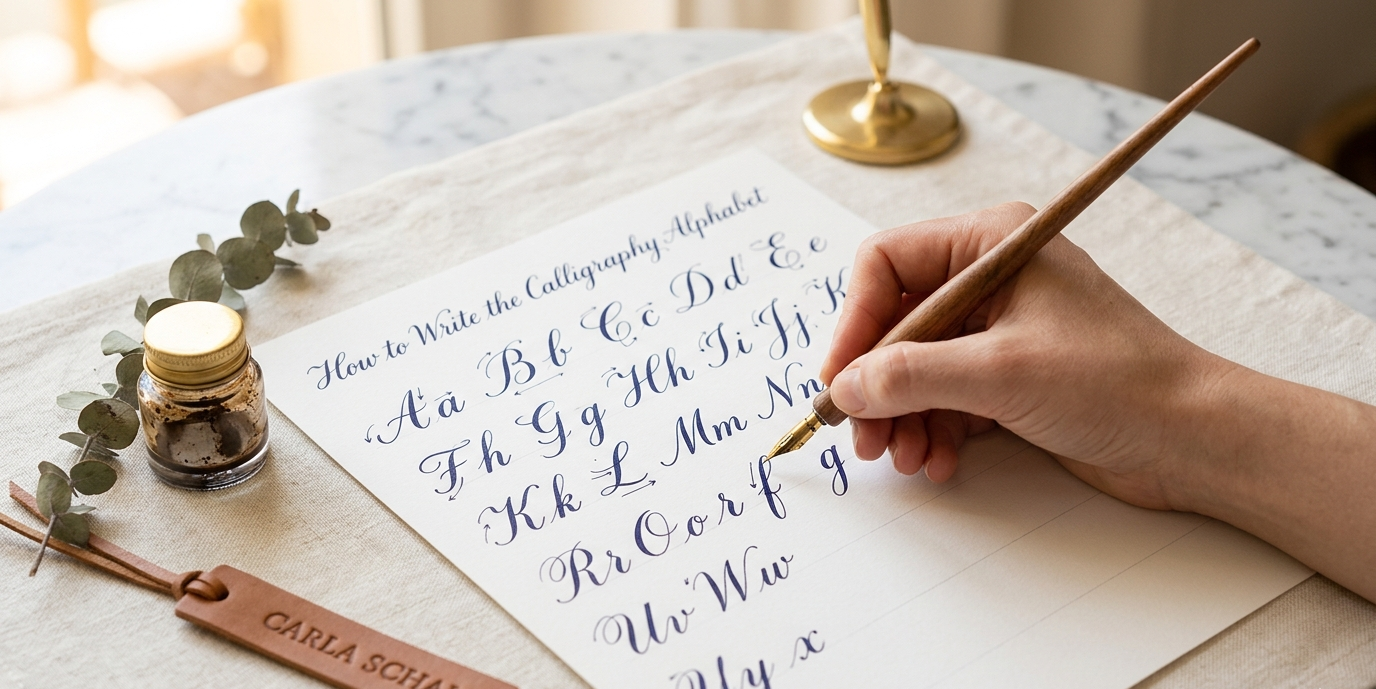


Learning how to write the calligraphy alphabet is the most foundational skill you can develop as a beginner. Every other aspect of calligraphy, from spacing and composition to flourishing and envelope addressing, builds on your ability to form individual letters with consistency and intention.
This guide teaches you the alphabet systematically, following the approach used by trained calligraphy instructors. You will learn the stroke families that connect letters, the most common mistakes to avoid letter by letter, and how to structure your practice for real, measurable improvement.
Start With Strokes, Not Letters
The single most important insight in beginner calligraphy education is this: letters are not the building blocks. Strokes are.
Every letter in the calligraphy alphabet is assembled from a small set of repeating strokes. Learning those strokes first means that by the time you attempt your first full letter, your hand already knows most of the movements required.
The Five Core Strokes
In italic and foundational calligraphy, five strokes form the basis of nearly every letter. These are the entrance stroke (a thin leading line that begins most lowercase letters), the oval stroke (the compressed or circular body found in letters like a, b, d, e, g, o, p, q), the arch stroke (used in m, n, r, h), the diagonal stroke (used in v, w, x, z), and the exit stroke (the trailing line that connects letters in cursive styles).
Practice each of these strokes in isolation, filling entire lines of practice paper before you move to letterforms. This feels tedious at first, but it accelerates your progress considerably.
Setting Up Your Practice Space
Before attempting a single letter, your setup needs to be correct. Poor posture, inadequate lighting, and the wrong paper angle are responsible for more beginner frustration than any lack of talent.
Paper Position and Body Posture
Calligraphers typically position their paper at a slight angle rather than straight ahead. For italic calligraphy, the page often tilts slightly to the left for right-handed writers, allowing your elbow to move freely along the writing line without twisting your wrist.
Sit with your feet flat on the floor, your writing arm resting comfortably on the desk, and your non-writing hand holding the paper steady. Your fingers should guide the pen, but the primary movement should come from your arm and shoulder, not your fingers alone.
Paper and Tool Selection
Using the wrong paper for your chosen style will undermine your results regardless of technique. For pointed pen scripts like copperplate, you need hot-pressed or laser-finished paper to prevent your nib from catching on the surface. For broad-edged pen scripts, layout paper or cartridge paper works well.
Understanding which calligraphy supplies to use as a beginner will prevent you from spending money on tools that actively work against your progress.
The Lowercase Calligraphy Alphabet: Letter by Letter
The following section walks through the lowercase italic alphabet, the most commonly taught starting point for beginners, grouped by stroke family for efficient learning.
The Oval Family: a, c, d, e, g, o, q
All oval-family letters begin with a similar oval or partial oval shape. Start at the one-o-clock position on your oval, curve counterclockwise to form the body, then add the specific distinguishing element for each letter.
For the letter a, complete the oval and add a vertical downstroke on the right side. For c, leave the oval open on the right side. For d, complete the oval and add a tall ascending vertical stroke to the right. For e, begin with a horizontal entry stroke, then form a partial oval that remains open at the right. For g, the oval mirrors a but adds a descending loop below the baseline. For o, close the oval completely. For q, mirror d by placing the ascending stroke to the left.
Practice each oval family letter on at least two full rows of practice paper before moving to the next group.
The Arch Family: h, m, n, r, u
Arch-family letters are built on a curved stroke that branches from an initial downstroke. Begin with a full descending stroke, then introduce the branching arch approximately two-thirds of the way up on the return journey.
For h, the arch branches to the right and descends to the baseline. For n, you add one complete arch. For m, you add two arches in sequence. For r, the arch begins but stops short, creating the characteristic open shoulder of the letter. For u, the arch is inverted, curving down and back up.
The spacing within arch-family letters is one of the most telling indicators of developing skill. Consistent internal spacing, the space within the arch as compared to the space between letters, is what gives calligraphy its rhythmic visual quality.
The Diagonal Family: k, v, w, x, z
Diagonal letters introduce straight lines at angles, which contrast with the curves of oval and arch families. Maintain your nib angle consistently through these letters to ensure that diagonals read as intentional.
For v and w, two diagonal strokes meet at a lower point before ascending. For k, a vertical stroke is intersected by two diagonal arms. For x, two diagonal strokes cross at the midpoint of the letter. For z, a horizontal entry stroke, diagonal, and horizontal exit create the signature angular structure.
The Remaining Letters: b, f, i, j, l, p, s, t, y
These letters do not fall neatly into one stroke family but combine elements from multiple groups.
b is essentially a mirrored d, beginning with a tall descending stroke and adding an oval on the right side at the baseline. l is a single descending stroke with a slight curved exit. i is the arch without its full arch, a simple downstroke with an entrance and exit, topped with a dot. j mirrors i but adds a descending curve below the baseline. p descends below the baseline and adds an oval to the right at the baseline level. t is a vertical stroke intersected by a horizontal crossbar slightly above midpoint. f descends below the baseline with an ascending loop and a crossbar. y uses an arch followed by a descending diagonal that loops below the baseline. s is the most anatomically complex letter for most beginners. Break it into a top curve and bottom curve that connect at the midpoint, practicing them as separate movements before combining them.
The Uppercase Calligraphy Alphabet
Uppercase letters in calligraphy are typically larger, often more elaborate, and in copperplate and Spencerian scripts, frequently include decorative swashes and flourishes. For beginners, the priority is clean, proportional construction before adding ornamentation.
Starting Points for Uppercase
In italic calligraphy, most uppercase letters are simply enlarged versions of their lowercase counterparts with slight stylistic adjustments. In copperplate, uppercase letters often include leading loops, oval entries, and extended descending or ascending strokes that serve as decorative frames for the letter body.
Begin uppercase practice by writing each letter in isolation, assessing proportion relative to your lowercase. The uppercase letter should be approximately one and a half times the x-height (the height of your lowercase letters) in standard italic practice.
Letters That Require Special Attention
B, D, P, and R all include oval elements combined with vertical strokes. Ensure the oval portions are fully closed and proportionate to the vertical stem.
M, N, and W involve multiple diagonal or arch elements that must remain consistent in angle and spacing. These letters are among the most technically demanding in italic uppercase work.
G, C, and Q require careful attention to the entry and exit points of the oval to maintain the distinction between them in running script.
Common Letter-Level Mistakes and How to Fix Them
Certain letters consistently challenge beginners across skill levels. Identifying the mechanical cause of each mistake allows you to correct it systematically rather than simply repeating the error.
The Letter “a” Problem
Many beginners form the oval of a too round, losing the compressed italic quality. Remind yourself that the oval should fit inside a narrow rectangle, not a square. Exaggerated roundness breaks the visual rhythm of the entire word.
The Letter “g” Problem
The descending loop of g is often inconsistent in size and direction. The loop should be roughly the same size as the oval above it, and it should curve back to the left with intention rather than swinging randomly. Practice the descending loop stroke in isolation before reattaching it to the full letter.
The Letter “s” Problem
Beginners frequently form s too symmetrically, giving both curves equal weight. In italic calligraphy, the bottom curve of s is typically slightly wider than the top. This asymmetry is what makes s feel visually balanced rather than stiff.
The most common calligraphy mistakes beginners make extend beyond individual letters into spacing, pressure, and nib angle. Addressing both letter-level and global technique issues in tandem accelerates improvement significantly.
Building Words From Letters
Once you can form individual letters with reasonable consistency, the next challenge is connecting them fluidly into words. Letter connections are not simply about drawing a line between two letters. They require that the exit stroke of one letter matches the entry angle of the next.
Spacing Principles
In calligraphy, visual spacing matters more than mathematical spacing. The space between letters is judged by eye to feel consistent, not by measuring identical pixel-width gaps. A letter combination like “rn” requires slightly more physical space than “nn” because the visual density of their strokes differs.
Practice common letter combinations in isolation: nd, ou, at, in, th, er. These are among the most frequent pairings in English and developing fluency with them will noticeably improve your overall word quality.
How to Structure Your Practice for Progress
Random letter repetition produces improvement, but structured targeted practice produces transformation. The key is to identify your weakest letters each session and prioritize them rather than defaulting to your strongest ones.
A Weekly Practice Framework
Dedicate your first session of each week to stroke review. Your second session should focus on your three most challenging letters. Your third session should practice those letters within whole words. By your fourth session, you should be writing short phrases that include your difficult letters in context.
Learning how to practice calligraphy every day with a routine that actually works transforms the alphabet from a challenge into a creative resource.
The Value of In-Person Instruction
Letters that stubbornly refuse to improve despite regular practice usually have a mechanical root cause that is difficult to self-diagnose. A live instructor can watch your hand form a single letter and immediately identify whether the problem is grip, angle, entry point, or pressure.
Carla Schall’s Florida calligraphy workshops are structured to address exactly these letter-level technical issues, providing the kind of real-time correction that self-teaching simply cannot replicate. Exploring private calligraphy lessons as a supplement to group learning can dramatically shorten your learning curve.
How to Write the Calligraphy Alphabet With Consistency
Consistent letterforms are the hallmark of trained calligraphic work. They emerge not from talent but from deliberate repetition, thoughtful self-evaluation, and the willingness to isolate and correct individual elements rather than practicing whole passages.
Write the full calligraphy alphabet daily. Compare your letters to your reference guide. Mark the ones that deviate from your model and spend focused time on those specific letters before writing the alphabet again.
Progress in calligraphy is not linear. There will be sessions where your letters feel worse than the week before. This is normal, and it typically signals that your brain is integrating a new technical adjustment before your hand catches up.
Trust the process, stay consistent, and remember that every letter you practice is building the foundation of a lifelong skill.
FAQ
Most beginners can form all 26 lowercase letters with recognizable consistency within four to eight weeks of daily 20-minute practice. Uppercase letters and connected script typically require an additional four to six weeks.
Start with lowercase. The foundational stroke families are simpler to learn in lowercase, and most calligraphy applications (writing, cards, envelopes) use lowercase more frequently.
For broad-edged pen scripts, good quality layout paper or smooth cartridge paper works well. For pointed pen scripts, you need a smoother surface. Rough printer paper will catch your nib and produce inconsistent strokes.
Yes. Left-handed calligraphy requires some technique adjustments, including paper angle and pen hold, but is entirely achievable. Specific guidance onleft-handed calligraphy tips makes the process far more manageable.
Lined or gridded practice paper is strongly recommended for beginners. Consistent letter height is one of the most important visual qualities in calligraphy, and guidelines help you develop that consistency before your eye becomes calibrated enough to self-regulate.
Learn the alphabet directly from Carla in a hands-on Florida calligraphy workshop, where real-time feedback replaces months of guesswork. Book your workshop at carlaschall.com