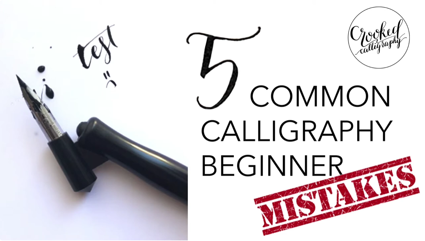


Every beginner makes calligraphy mistakes. That is not a problem. What becomes a problem is making the same mistakes repeatedly without understanding their root cause, because without that understanding, practice reinforces errors rather than eliminating them.
The five mistakes covered in this guide are the most consistent issues that appear in beginner calligraphy across scripts, tools, and backgrounds. More importantly, each one has a specific, practical fix that produces visible improvement quickly. If any of these sounds familiar, you are already closer to solving it than you think.
Mistake One: Inconsistent Letter Angle
Inconsistent slant is one of the most immediately visible problems in beginner calligraphy, and it is almost always caused by hand movement rather than letter construction.
When letters lean at different angles across a word or line, the visual rhythm of the text collapses. The eye reads inconsistency as incompetence, even when individual letterforms are well-formed.
Why It Happens
Most beginners form letters by moving their fingers and wrist rather than their arm and shoulder. This finger-driven writing movement naturally introduces angle variation because the wrist rotates as it moves across the page, gradually shifting the angle of the pen relative to the paper.
The Fix
The solution is to move your writing instrument with your arm, using the shoulder as the primary pivot point and the fingers only to guide rather than drive the pen. This arm-driven movement maintains a consistent pen angle because the shoulder does not rotate the way the wrist does.
Practice writing diagonal strokes repeatedly across a full page, focusing on keeping each stroke at exactly the same angle. Once your arm movement is consistent, letter angle becomes a natural consequence of correct form rather than something you consciously manage stroke by stroke.
Using slant guidelines on your practice paper during this correction phase provides visual feedback on your progress. For copperplate specifically, a 52-degree slant grid keeps your eye and hand calibrated as you build the new movement pattern.
Mistake Two: Too Much Pressure on Upstrokes (Pointed Pen Scripts)
In pointed pen calligraphy, excess pressure on upstrokes is one of the most damaging technical errors. It catches the nib, produces blobs instead of hairlines, tears the paper surface, and can permanently damage a new nib in a single session.
Why It Happens
Beginners intuitively apply more pressure when they want their pen to move smoothly. The counterintuitive truth is that upstrokes in pointed pen calligraphy require you to release pressure almost completely, allowing the nib tines to come together into a hairline.
Applying pressure on the upstroke forces both nib tines into the paper surface, creating resistance. The nib catches, sprays ink, or produces a scratchy, jagged line instead of the clean, flowing hairline that defines the style.
The Fix
Practice isolated upstroke drills before attempting letters. Hold your pen so lightly on upstrokes that you can barely feel the nib touching the paper. The contact should be the weight of the pen itself, not any additional hand pressure.
Work from drills to entry strokes to simple letters before attempting full words. The most common calligraphy mistakes and how professional instruction addresses them quickly confirm that pressure control is the technical issue most dramatically improved by live teaching over self-directed practice.
Mistake Three: Wrong Paper Choice
Paper selection is treated as a secondary consideration by most beginners, but the wrong paper can make technically sound calligraphy look rough, inconsistent, and amateurish.
Why It Happens
Beginners naturally reach for whatever paper is available, typically standard printer paper, notebook paper, or sketch paper. These surfaces are designed for pens with consistent round tips and do not accommodate the specific needs of calligraphy nibs.
For pointed pen scripts, rough paper catches the delicate nib tines, causing them to spray, scratch, or dig into the surface. For broad-edged nib scripts, textured paper produces feathered edges instead of clean, crisp strokes.
The Fix
For pointed pen calligraphy (copperplate, Spencerian, modern scripts), use hot-pressed paper, laser-finished paper, or dedicated calligraphy practice sheets. Rhodia pads, Clairefontaine paper, and HP Premium Laser Paper are all widely recommended by professional calligraphers.
For broad-edged scripts (italic, gothic, foundational), smooth cartridge paper or layout paper works well. You need a consistent, slightly resistant surface that holds ink cleanly without feathering.
The full range of calligraphy supplies and how to choose them for different scripts provides specific recommendations matched to each style.
Mistake Four: Incorrect Pen Angle for Broad-Edged Nibs
For italic and gothic calligraphy students, maintaining the correct pen angle (the angle of the nib edge relative to the writing line) is the foundational technical requirement for creating proper thick-thin stroke contrast.
Why It Happens
Most people hold a pen at whatever angle feels comfortable, which for most people means a relatively shallow, near-horizontal position. In broad-edged calligraphy, this comfortable position is typically wrong. Italic requires a consistent 40 to 45-degree pen angle, and gothic requires 40 to 45 degrees in a slightly different relationship to the letterform structure.
When the pen angle shifts during writing, thick strokes appear where thin strokes should be and vice versa. The characteristic visual logic of the script is lost entirely.
The Fix
Before writing any letters, practice checking your pen angle with a visual reference. Place a protractor or angle guide against the writing line and set your nib edge against it to internalize what 45 degrees feels and looks like.
Then practice making diagonal marks at a consistent angle, checking periodically against your reference. This isolates the angle problem from the letterform problem, allowing you to solve each separately.
Writing very slowly during the correction phase is more effective than writing at a normal pace. Speed will return naturally once the angle is internalized.
Mistake Five: Not Using Guidelines (or Ignoring Them)
Calligraphy without guidelines is like building without levels. The absence of reference lines introduces three simultaneous variables (letter height consistency, baseline straightness, and x-height proportion) that compound into significant visual inconsistency.
Why It Happens
Guidelines feel like a crutch, and many beginners abandon them too early in the belief that “real” calligraphers work freehand. This is a misconception. Professional calligraphers use guidelines extensively, particularly for client work where consistency is non-negotiable.
Even experienced calligraphers working on large formal commissions almost always use some form of baseline guidance, whether pencil guidelines, a light box with pre-ruled guide sheets, or mechanical ruling.
The Fix
Use pre-ruled practice sheets or create your own with a pencil and ruler for every practice session for your first six months of learning. After that period, your eye will be calibrated enough to work without guidelines in casual contexts, but you should continue using them for formal work and client commissions throughout your career.
Guidelines for calligraphy typically include a baseline (where letters sit), an x-height line (the top of lowercase letters), and ascender and descender lines for tall and deep letters. Some scripts also use slant guidelines.
For a comprehensive understanding of how to practice calligraphy every day with a routine that builds real skill, guideline discipline is one of the non-negotiable elements of effective practice structure.
Bonus Mistake: Skipping Stroke Drills to Write Words
This is perhaps the most common sequencing error beginners make. They want to write words and sentences immediately, skipping the foundational stroke work that makes letter construction consistent and fluent.
Letters are assemblages of strokes. Without solid stroke control, letters are assemblages of accidents. Every session spent on isolated stroke practice before letters directly translates into faster, more dramatic improvement in your actual letterwork.
Devote the first five to ten minutes of every practice session to stroke repetition, regardless of your skill level. This warm-up practice is not remedial. It is the technical foundation that makes everything else possible.
How Fast Can You Fix These Mistakes?
The timeline for correcting these five mistakes depends on how ingrained the bad habits are and how consistently you practice the corrections. For new beginners who catch these issues early, significant improvement is typically visible within two to four weeks of targeted correction practice.
For learners who have been practicing incorrect technique for months, the timeline extends to six to twelve weeks for deeply ingrained habits. This is because you are not just building new skill. You are also overwriting existing muscle memory, which requires both correct repetition and the active suppression of the incorrect pattern.
Private calligraphy lessons accelerate this process dramatically. An instructor who can watch your technique in real time can identify which of these five mistakes is your primary issue in minutes, compare it against your self-assessment, and give you specific drill prescriptions that target your individual error pattern rather than generic advice.
The 5 Most Common Calligraphy Mistakes: Summary
Inconsistent letter angle, too much pressure on upstrokes, wrong paper, incorrect pen angle, and skipping guidelines are the five technical issues that most consistently hold beginners back from the results they are capable of producing.
None of these mistakes reflects a lack of talent. Every one of them reflects a specific technical misunderstanding that responds directly and quickly to informed correction. Identify which of these five applies to your current practice, apply the specific fix described here, and practice it deliberately for two weeks before assessing your progress.
Your calligraphy is better than your current mistakes suggest. You just need the right diagnostic lens to see past them.
FAQ
Compare your work to a reference model of your chosen script and identify the most obvious visual difference. Then trace that visual difference back to one of the five technical causes described in this guide. Inconsistency across letters typically points to angle or movement issues. Poor line quality in pointed pen scripts typically points to pressure management.
You can make significant progress on all five through self-directed practice with the right diagnostic information. However, pressure control and pen angle in particular are much faster to correct with live instructor feedback, because these issues are often invisible to the writer themselves.
Yes, particularly for pressure and angle issues. Slow, deliberate practice allows you to feel and observe your technique in real time. Once the correct technique is internalized, you can gradually increase speed without losing quality.
Yes, and it is a sign that your brain is integrating a new technical pattern. When you begin correcting a bad habit, the disruption of your existing muscle memory produces temporary inconsistency. This typically resolves within two to four weeks of consistent targeted practice.
Not necessarily. Identify your single most impactful mistake and correct that one first. Fixing the foundational issue, typically movement or angle, often automatically improves multiple symptoms simultaneously.
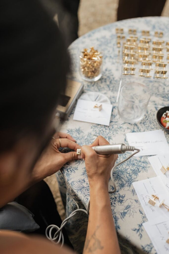
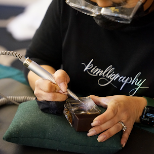
Fix bad habits fast and build correct technique from the ground up in a Carla Schall calligraphy workshop, where real-time feedback transforms your practice in a single session.Book your place at carlaschall.com