


Boho and classic are not just two wedding aesthetics. They represent two fundamentally different ways of communicating beauty through design.
One values organic imperfection, warmth, and the wild artistry of natural materials. The other values structured elegance, historical precedent, and the restrained perfection of craft mastered over generations.
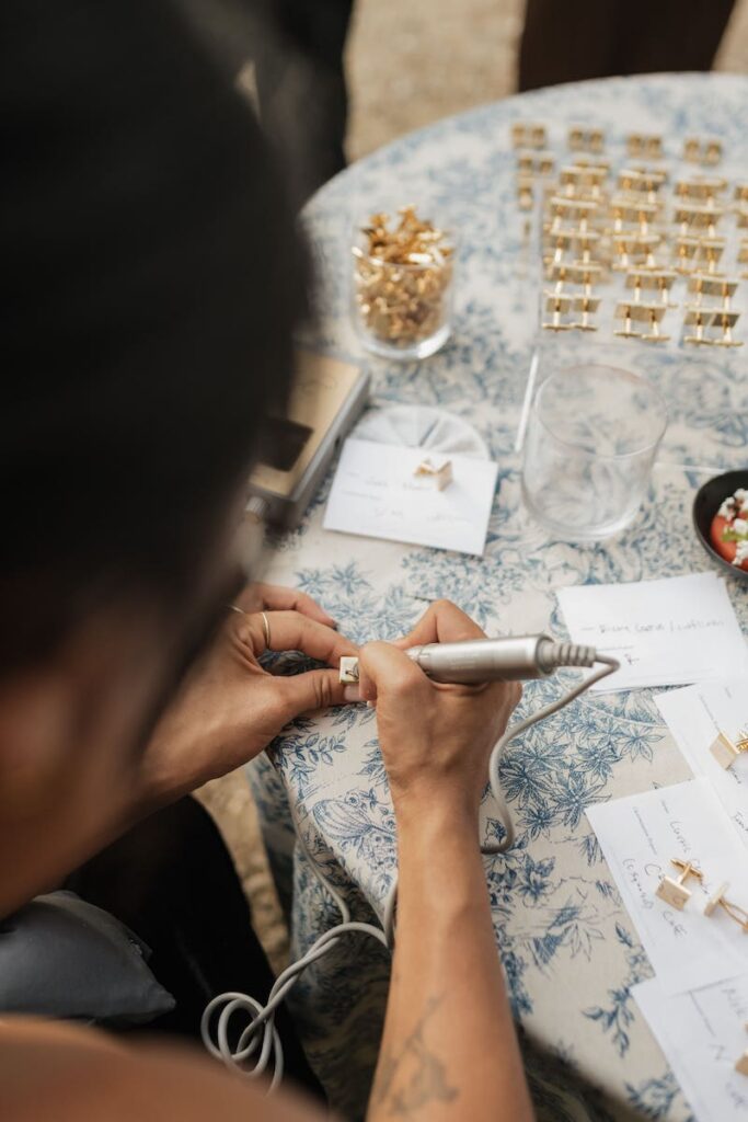
When it comes to wedding calligraphy, the difference between these two approaches shows in every letterform, every flourish, every ink color choice, and every material the lettering appears on.
Understanding which approach belongs at your wedding is one of the most impactful decisions you can make for the visual coherence of your day.
What “Boho” Actually Means in Wedding Calligraphy Terms
Bohemian wedding aesthetics draw from a specific visual vocabulary: dried botanicals, macramé textures, rust and terracotta color palettes, wildflower arrangements, raw linen, and light-drenched outdoor settings.
Calligraphy designed for this aesthetic follows the same visual logic.
Boho calligraphy favors organic, expressive letterforms that have movement and imperfection built in. The script looks like it was written with joy rather than precision. The ink might vary slightly in tone across a piece. Flourishes loop and trail in a way that feels botanical rather than architectural.
The result is calligraphy that looks like it belongs in the same world as dried pampas grass and worn wooden tables.
The Script Styles That Define Boho Calligraphy
Modern calligraphy in its looser, more expressive interpretations is the natural home of the boho aesthetic.
Within modern calligraphy, look for scripts characterized by: long ascending and descending strokes, naturalistic variations in ink density, organic looping connections between letters, and a slightly informal baseline that rises and falls gently across the word.
Brush lettering also works well for boho contexts, particularly for large-format pieces like welcome signs where the bold, painterly quality of brush strokes reads as energetic and artistic at scale.
For specific examples of how boho scripts appear across different wedding elements in Florida settings, the real Florida weddings calligraphy showcase includes examples across multiple boho-influenced celebrations.
What “Classic” Means in Wedding Calligraphy Terms
Classic wedding calligraphy draws from the long tradition of formal Western script: Copperplate, Spencerian, and the family of italic scripts that preceded and followed them.
These styles are defined by precision, consistency, and the centuries-long refinement of letterform structure toward an ideal of elegant legibility.
Classic calligraphy at a wedding communicates formality, care, and an appreciation for craft traditions that predate the digital era by hundreds of years.
It belongs naturally in grand ballrooms, estate venues, black-tie celebrations, and weddings that reference heritage, grandeur, or timeless elegance as their aesthetic north star.
The Script Styles That Define Classic Calligraphy
Copperplate is the gold standard of classic wedding calligraphy, characterized by its high contrast between thick and thin strokes, precise oval construction, and consistent 52-degree letterform slant.
Spencerian is the softer evolution of Copperplate, with reduced stroke contrast and a slightly more accessible visual personality that retains the formal register without the strictest severity of true Copperplate.
Both styles require years of dedicated practice to execute with the consistency expected at a professional level, which is why the skill gap between a trained classical calligrapher and a generalist lettering artist is particularly visible in formal wedding contexts.
The modern vs. traditional calligraphy comparison explores how these two branches of the craft differ in practice, philosophy, and the aesthetics they are best suited for.
Side by Side: How Boho and Classic Compare Across Wedding Elements
Invitation Suites
A boho invitation suite typically uses a modern organic script on uncoated or textured paper with warm earth-tone ink. The envelope addressing may include trailing flourishes and vines or botanical illustrations integrated with the calligraphy.
A classic invitation suite uses Copperplate or Spencerian on heavy, smooth card stock in deep black or midnight navy. The precision of the letterforms is front and center, and the design relies on the script’s inherent beauty rather than decorative additions.
Welcome Signs
A boho welcome sign on a wooden slice, dried floral wreath frame, or unfinished lumber board in a flowing modern script with dried botanicals integrated around the lettering is a quintessential example of the style.
A classic welcome sign on painted or lacquered wood, mirror, or cream mounting board in Copperplate black ink with a simple elegant border reads as poised and refined.
Escort Cards
Boho escort cards often use smaller, slightly uneven baselines, earthy ink tones, and are sometimes displayed tucked into a dried botanical installation or hanging from a twine-and-branch display structure.
Classic escort cards use consistent, formal name formatting, precise letterforms, and are typically displayed on a flat surface or in a structured frame arrangement that emphasizes order and symmetry.
Color Palettes
Boho calligraphy typically uses warm, natural ink tones: warm brown, sepia, terracotta, dusty rose, forest green, or muted gold.
Classic calligraphy typically uses deeper, more formal tones: deep black, navy, forest green, or highly polished gold or silver.
The 2026 wedding calligraphy trends report notes that the warmer boho palette is currently the more dominant trend in the broader market, while classic palettes are holding strong in the formal and luxury wedding segment.
Common Mistakes When Matching Style to Aesthetic
Mixing the Wrong Script with the Right Materials
A Copperplate script on rough kraft paper creates a jarring aesthetic collision, because the formality of the script and the casualness of the material are pulling in opposite directions.
Similarly, a very loose organic script on ivory pressed card stock with an embossed border looks incongruous because the materials suggest formality that the script does not deliver.
The most successful calligraphy aesthetic is one where script, material, ink, and display format are all telling the same story.
Choosing Based on What Looks Good Photographed, Not in Person
Some couples make the mistake of choosing a calligraphy style based entirely on how it looks in highly curated editorial photography rather than how it looks in the specific context of their venue and lighting.
A script that photographs strikingly on a dark surface in warm candlelight may read very differently in bright daylight at an outdoor venue.
Discussing your venue’s lighting conditions with your calligrapher and requesting a material sample in the actual context is one of the most useful pre-commission tests available.
Can You Combine Elements of Both Styles?
The most thoughtful wedding calligraphy often draws from both traditions without committing entirely to either.
A wedding with a mid-century modern venue, structured florals, and a restrained color palette might use a calligraphy style that has the precision of a classic script but the slight organic expressiveness of modern calligraphy, sitting exactly between the two categories.
This hybrid approach is only effective when the calligrapher has genuine fluency in both traditions, because executing a controlled hybrid requires more skill than executing either style purely.
Reviewing a calligrapher’s portfolio for evidence of range across both styles before booking for a hybrid brief is an important step.
How Your Venue Should Influence Your Script Choice
The architectural and atmospheric character of your venue is one of the most underused signals in script selection.
A stone estate with manicured gardens and formal interiors calls for a classic script.
A converted barn with exposed wood, soft lighting, and organic floral arrangements calls for a boho-leaning modern script.
A beachfront venue with white linens, natural light, and tropical florals is well-served by a clean, relaxed modern script that feels at home in natural settings.
The guide to choosing the right calligraphy style for your wedding maps venue types and aesthetic signals directly to recommended script categories for exactly this reason.
Conclusion
Boho and classic wedding calligraphy are both beautiful, and both are wrong for the other’s context.
The key to getting this decision right is honesty about your wedding’s actual aesthetic, not the aesthetic you aspire to or the aesthetic that is trending on Pinterest right now.
When your script, your materials, your florals, and your venue are all speaking the same visual language, the result is a wedding where every element feels intentional and every photograph tells a cohesive story.
The calligrapher’s job is to understand that language and express it in ink. Your job is to choose a calligrapher whose portfolio proves they speak it fluently.
See examples of both styles — book a wedding calligraphy consultation → Contact Carla Schall
FAQ
Boho calligraphy uses organic, expressive modern script styles with warm ink tones and naturalistic flourishes that feel casual and artisanal. Classic calligraphy uses precise, structured historical scripts like Copperplate and Spencerian that convey formal elegance and centuries of tradition.
Organic modern scripts in warm ink tones are the most frequently requested for Florida weddings in 2026, particularly for outdoor, coastal, and garden venues. Classic styles retain strong demand among couples planning formal ballroom or estate venue weddings.
Yes, but it requires a calligrapher with demonstrated fluency in both styles and a clear brief that specifies where each style applies. Using a formal script for the invitation suite and a more relaxed modern script for signage is one common and effective hybrid approach.
Warm, natural tones are most characteristic: sepia, terracotta, warm brown, dusty rose, muted gold, and deep green. These colors echo the organic, earthy material palette of bohemian wedding aesthetics and photograph beautifully in natural light settings.
Review their portfolio carefully for genuine range. A calligrapher who can execute both Copperplate with precision and fluid modern script with organic expressiveness will have clear examples of both in their body of work, not just variations within a single style category.